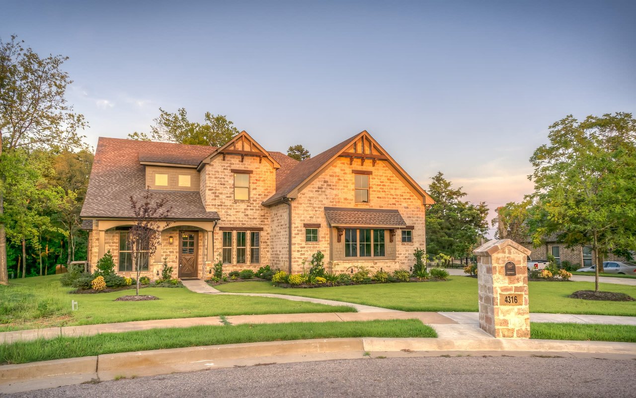
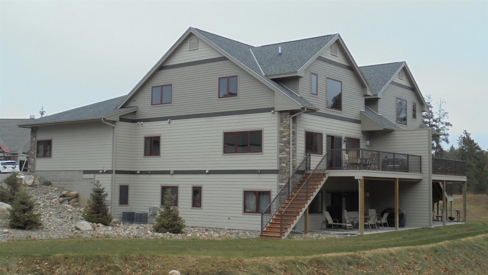
When it comes to creating a home that feels harmonious, inviting, and reflective of personal style, color is one of the most powerful tools available. From subtle neutral tones to bold accent hues, every shade carries emotional and psychological weight. Understanding how to harness color psychology in home design can help homeowners in Crosslake, MN, create intentional spaces that support wellbeing, functionality, and even market appeal.
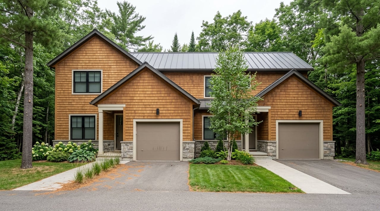
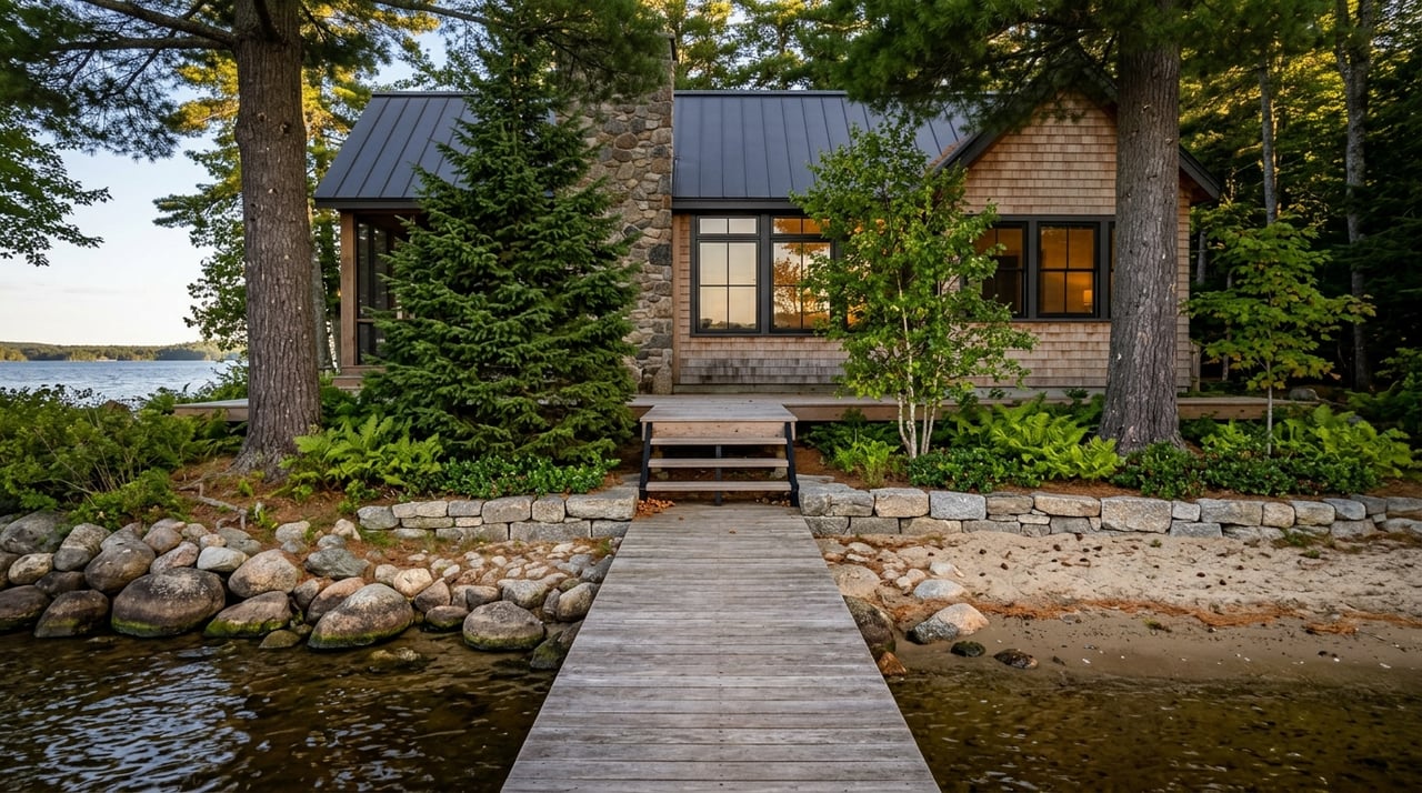
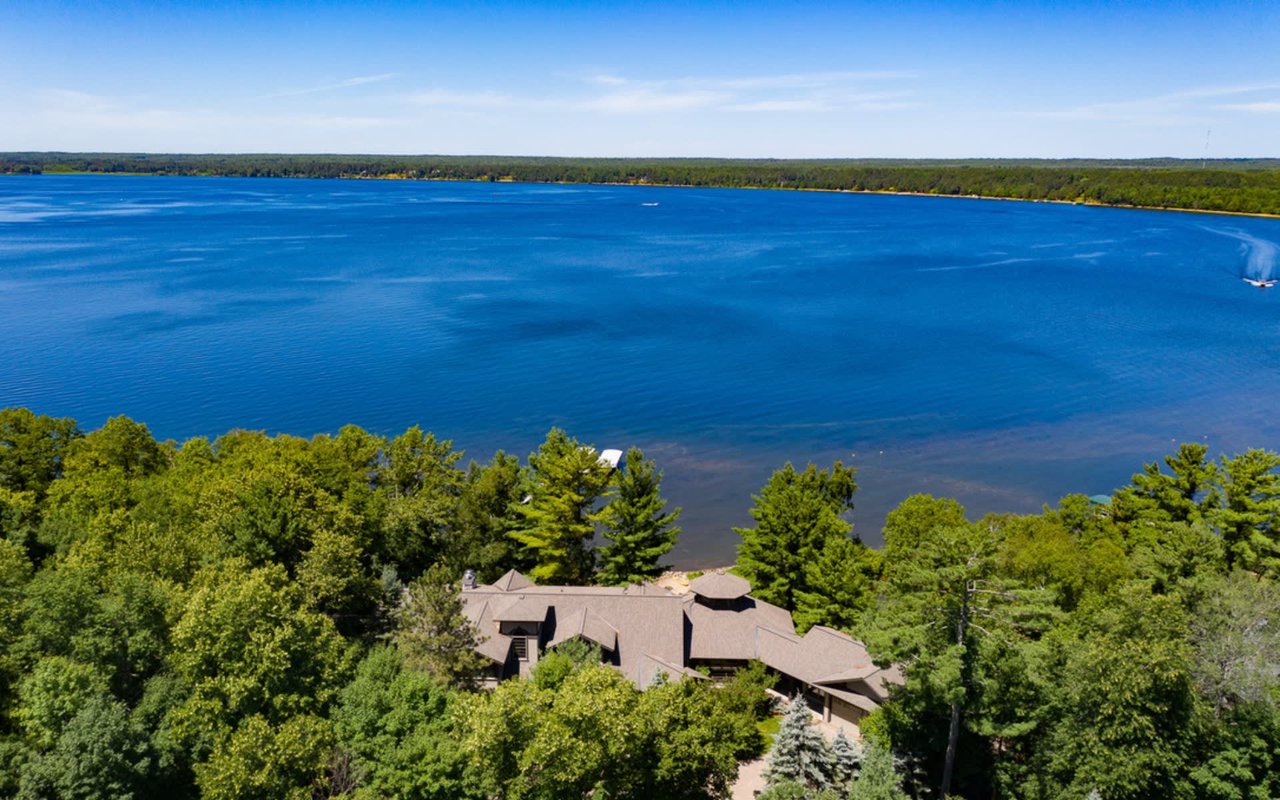
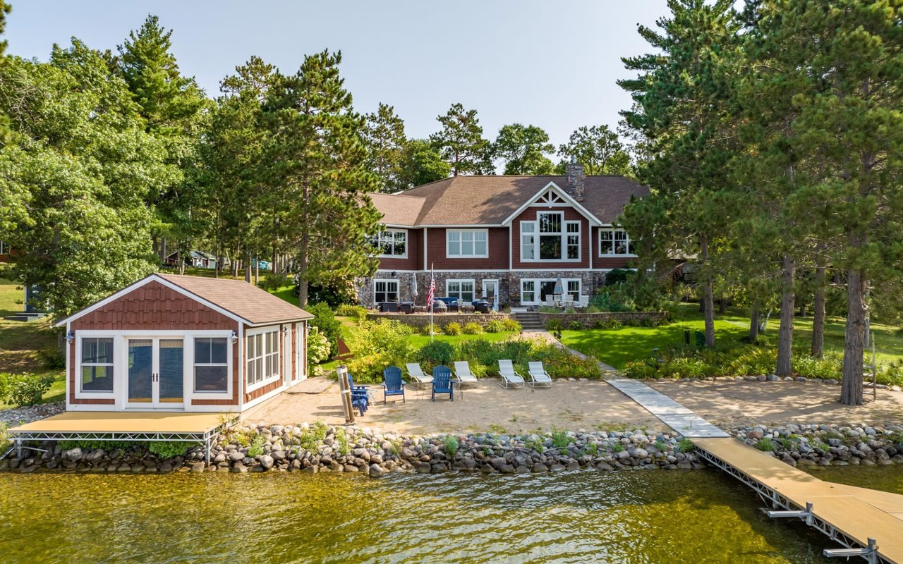
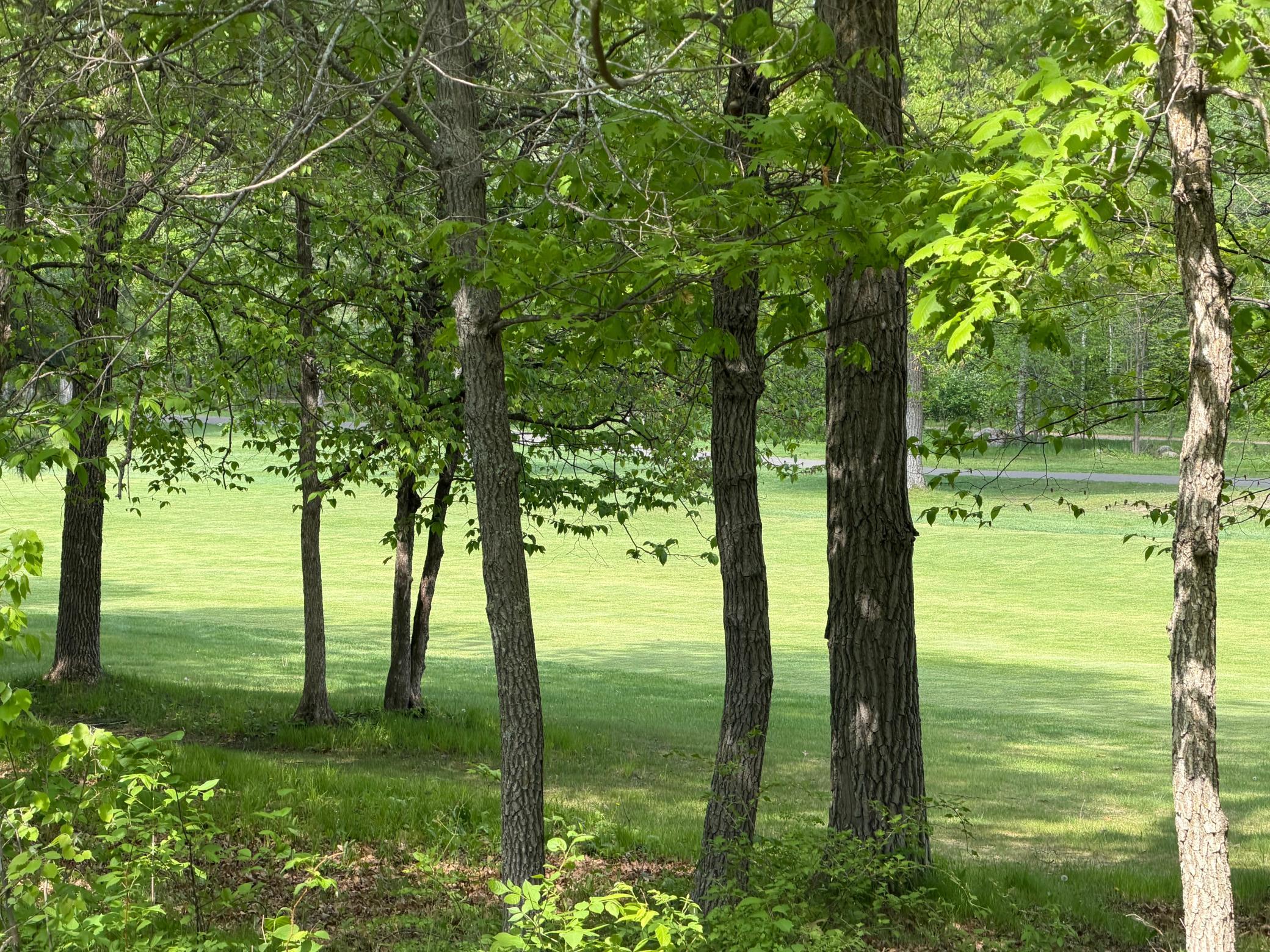
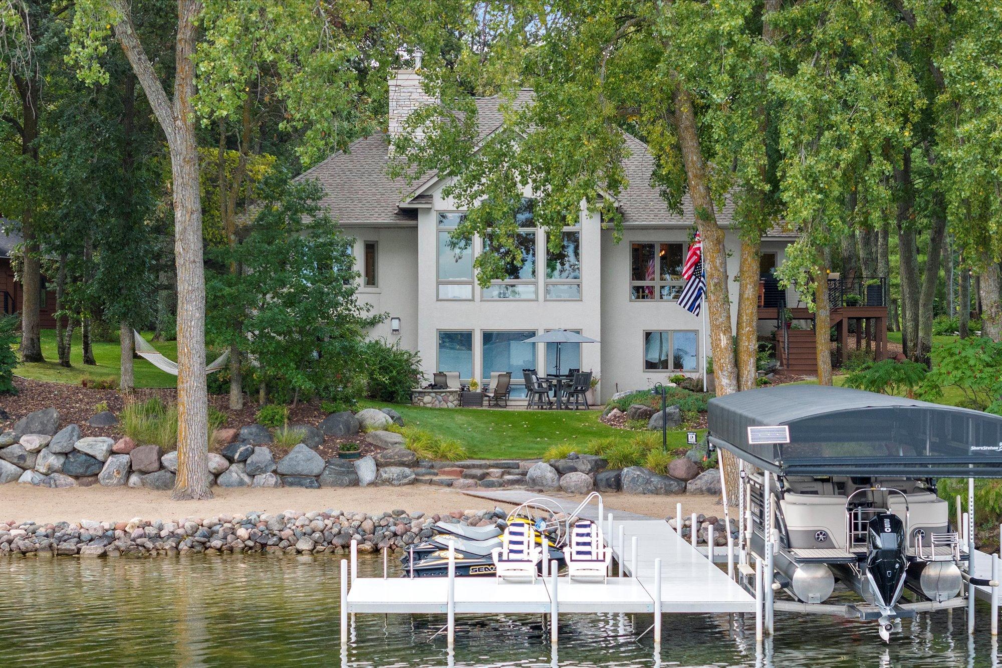
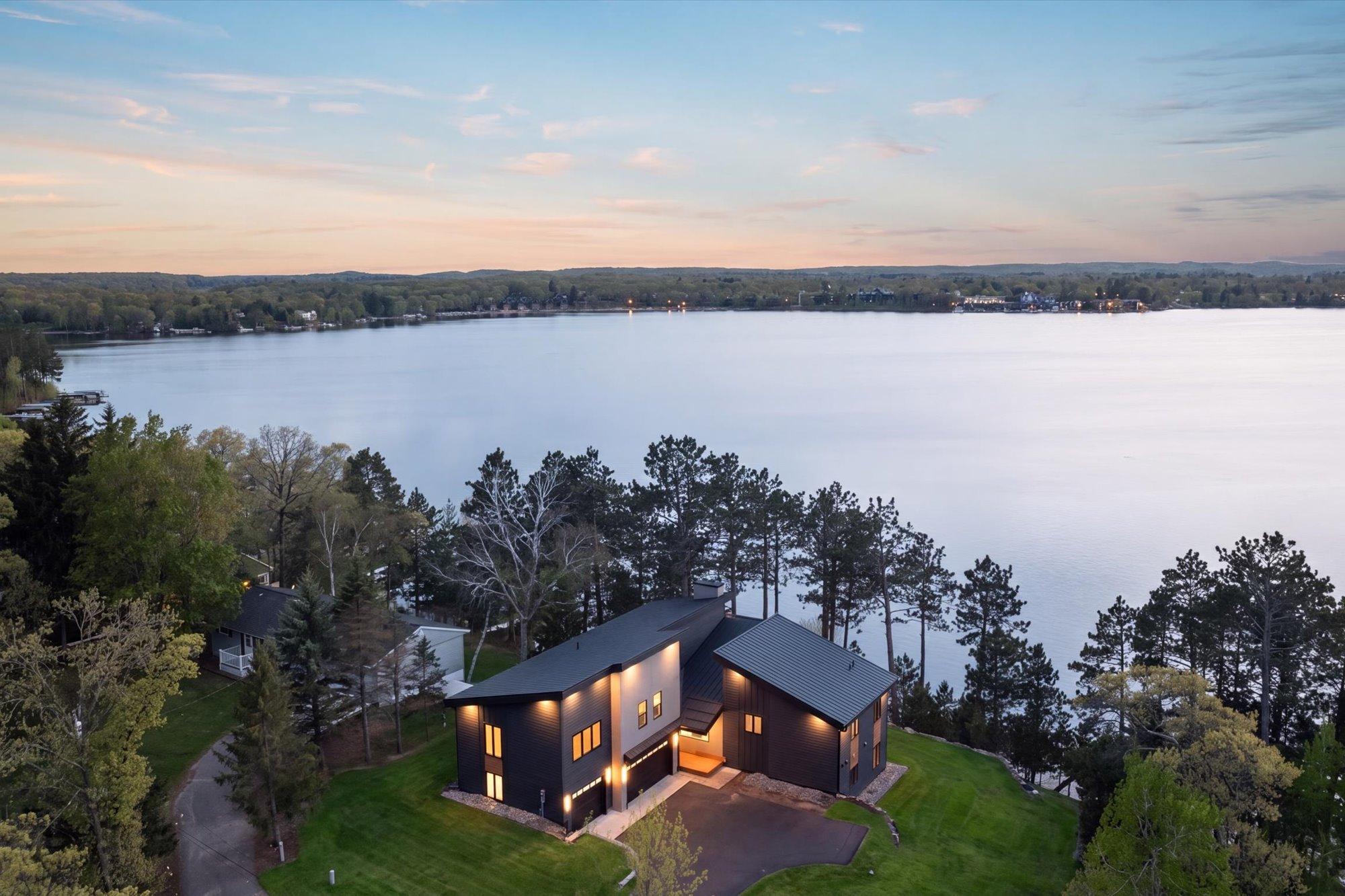
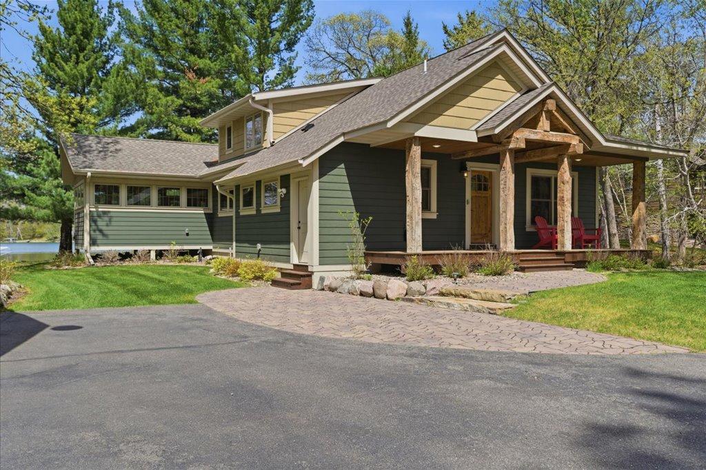
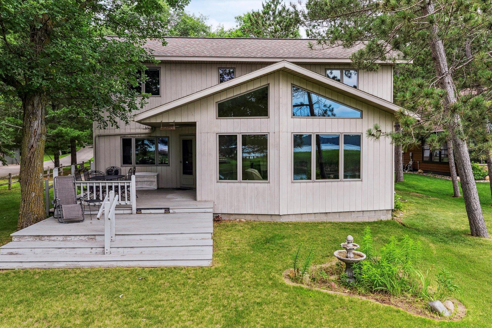
In a region like Crosslake, where the natural environment plays such a central role in daily life, color choices are often influenced by the surrounding lakes, forests, and seasonal changes. Whether you're designing a year-round residence or preparing a lakeside retreat, selecting the right palette for each room can elevate the overall experience of the home. By applying color psychology thoughtfully, homeowners can enhance energy in social spaces, promote calm in bedrooms, and create visual cohesion that adds both comfort and value.
The Basics of Color Psychology in Home Design
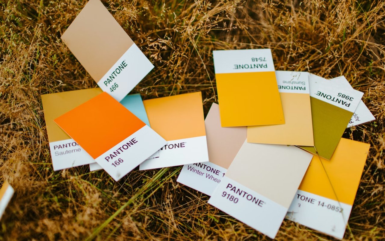
Color psychology is the study of how hues affect human behavior, mood, and perception. In home design, this concept helps guide decisions beyond aesthetics—it's about how each space feels and functions. Different colors evoke different emotional responses, and this can be strategically applied throughout the home based on the room’s purpose.
For example, warm colors like red, orange, and yellow tend to stimulate energy, creativity, and appetite, making them suitable for kitchens, dining rooms, or exercise spaces. Cool tones such as blue, green, and lavender are associated with calm, focus, and relaxation, making them ideal for bedrooms, bathrooms, or meditation spaces. Neutrals like gray, beige, and white provide versatility and can serve as grounding backdrops that allow accent colors to shine.
Incorporating color psychology in home design is not about following strict rules, but rather understanding the emotional impact of each hue and aligning that with how a room is used and experienced.
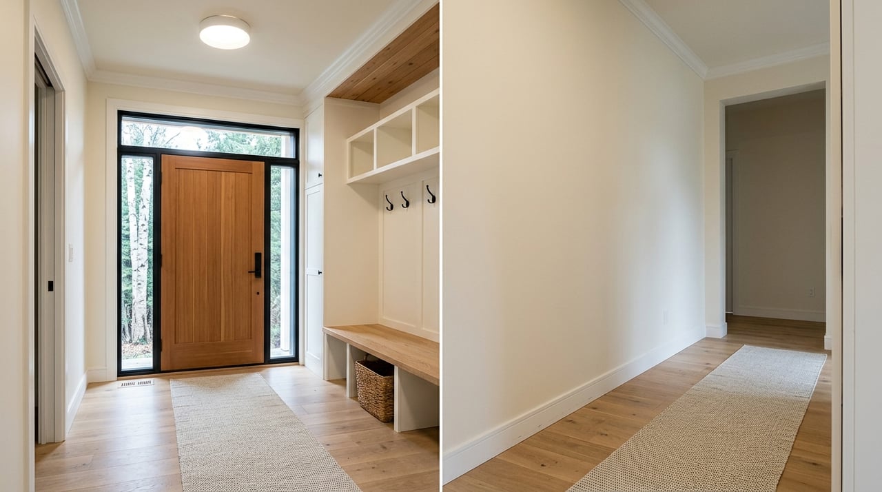
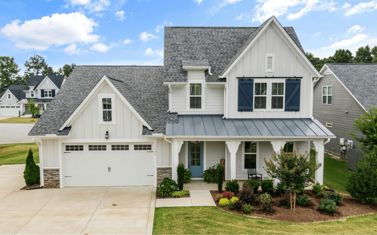
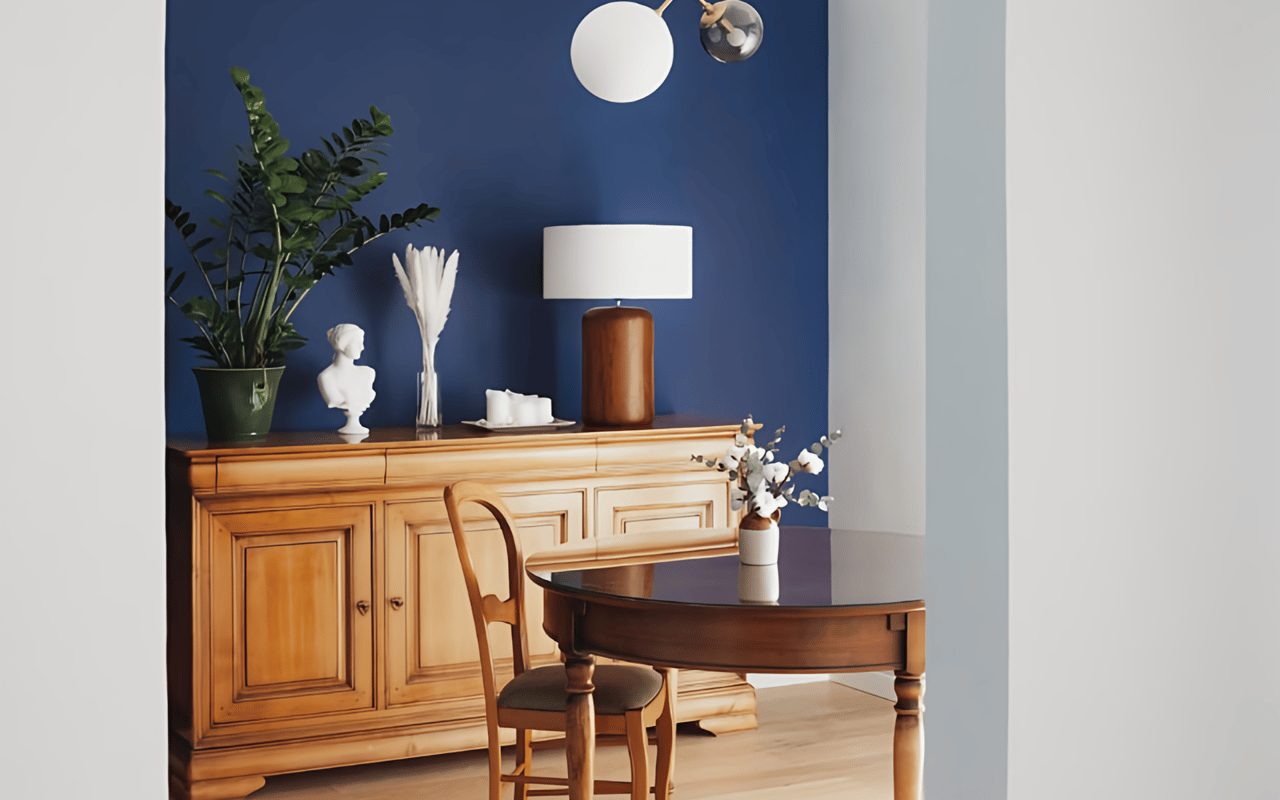
Creating a Welcoming Entryway
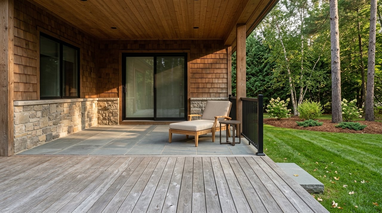
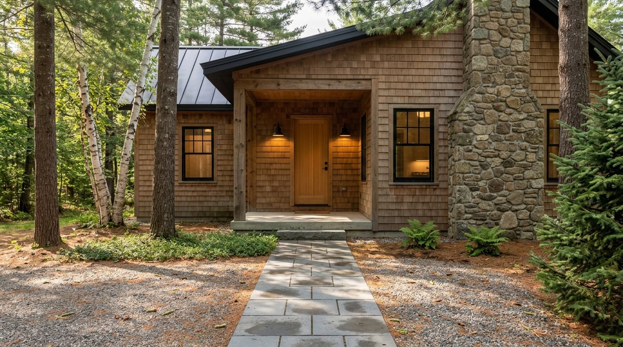
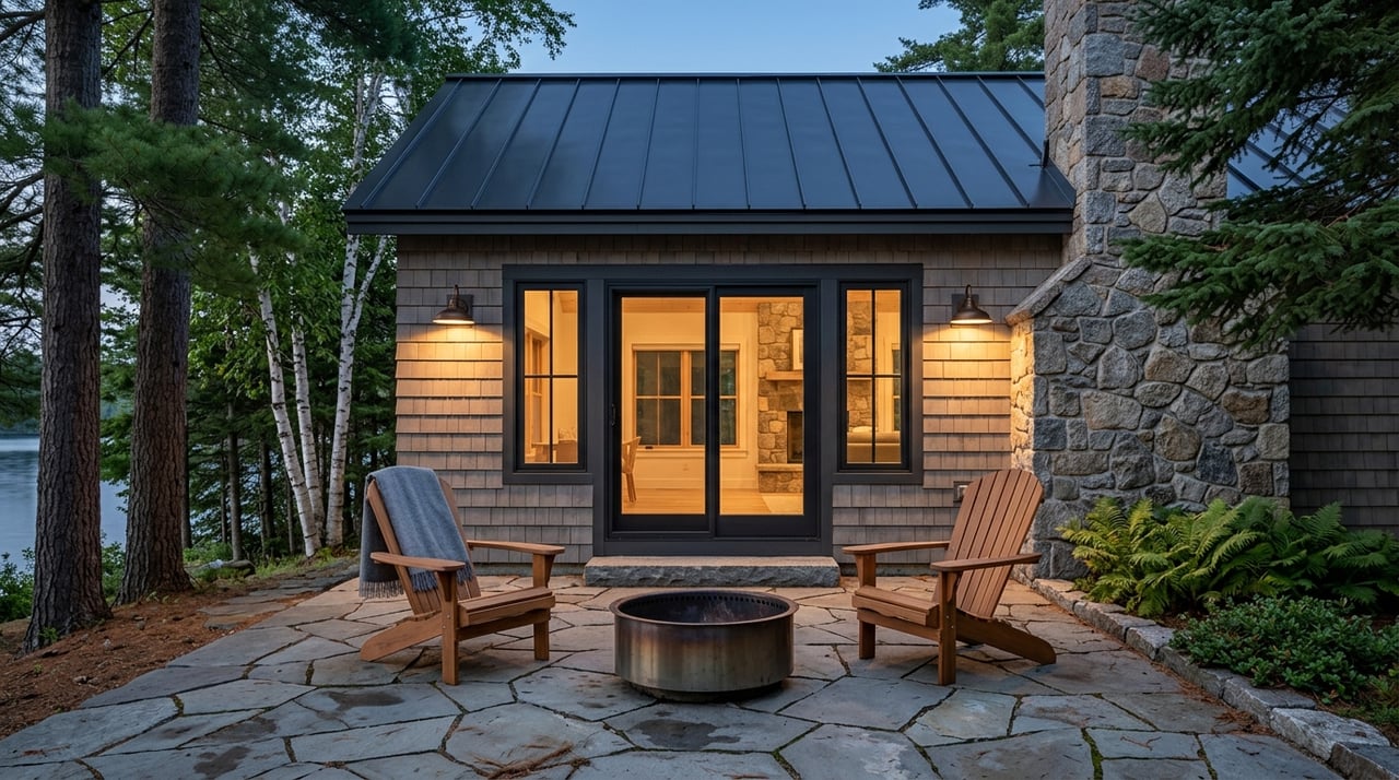
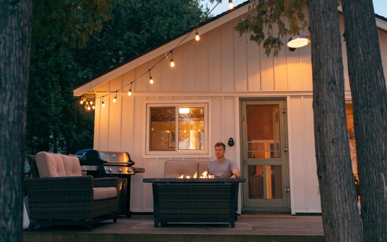
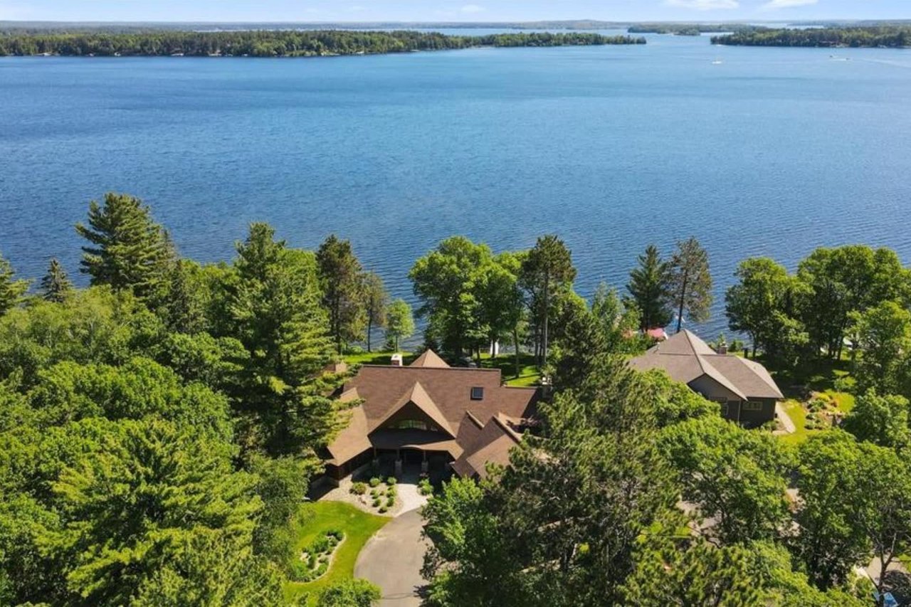
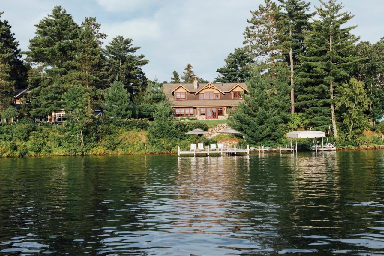
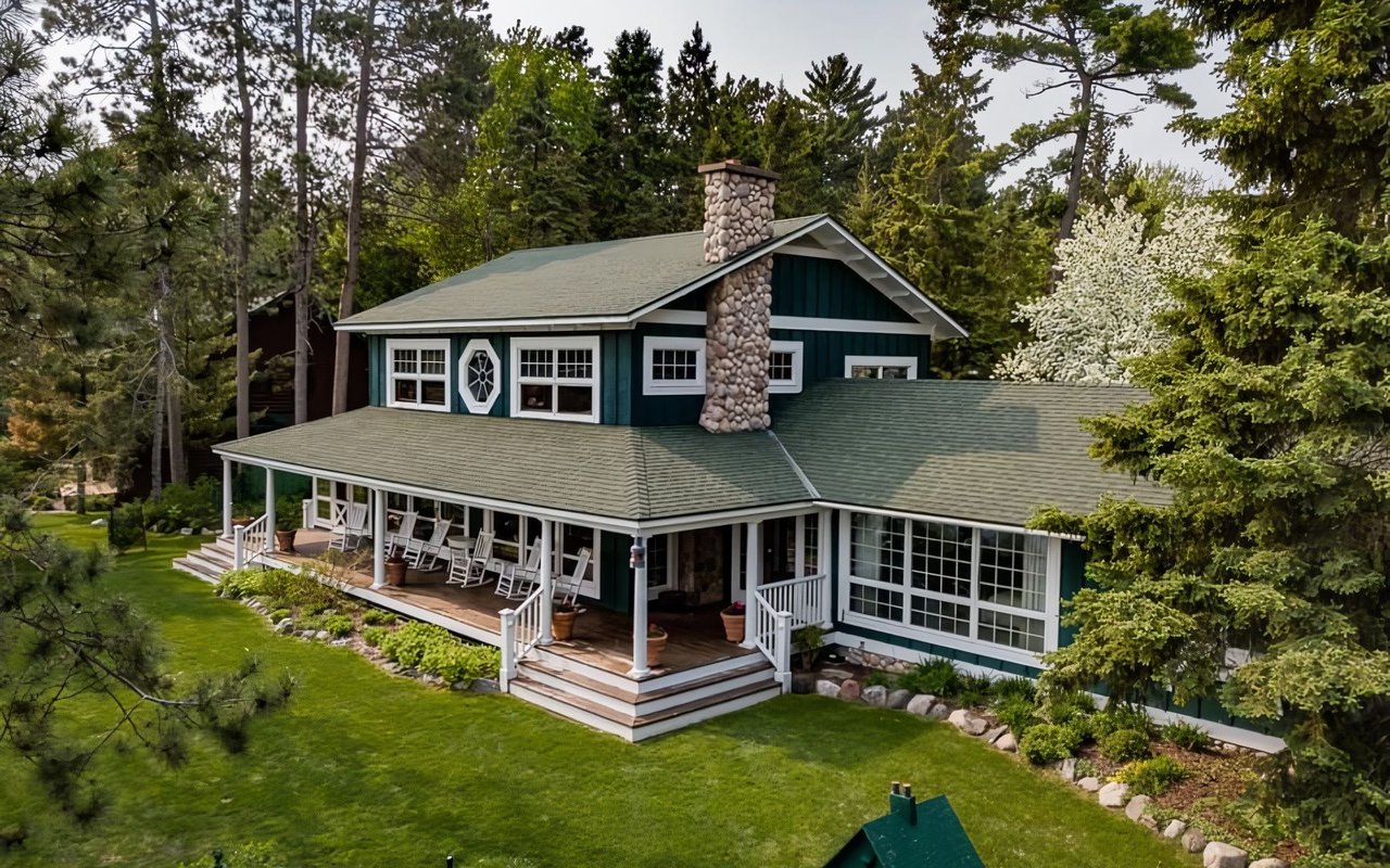
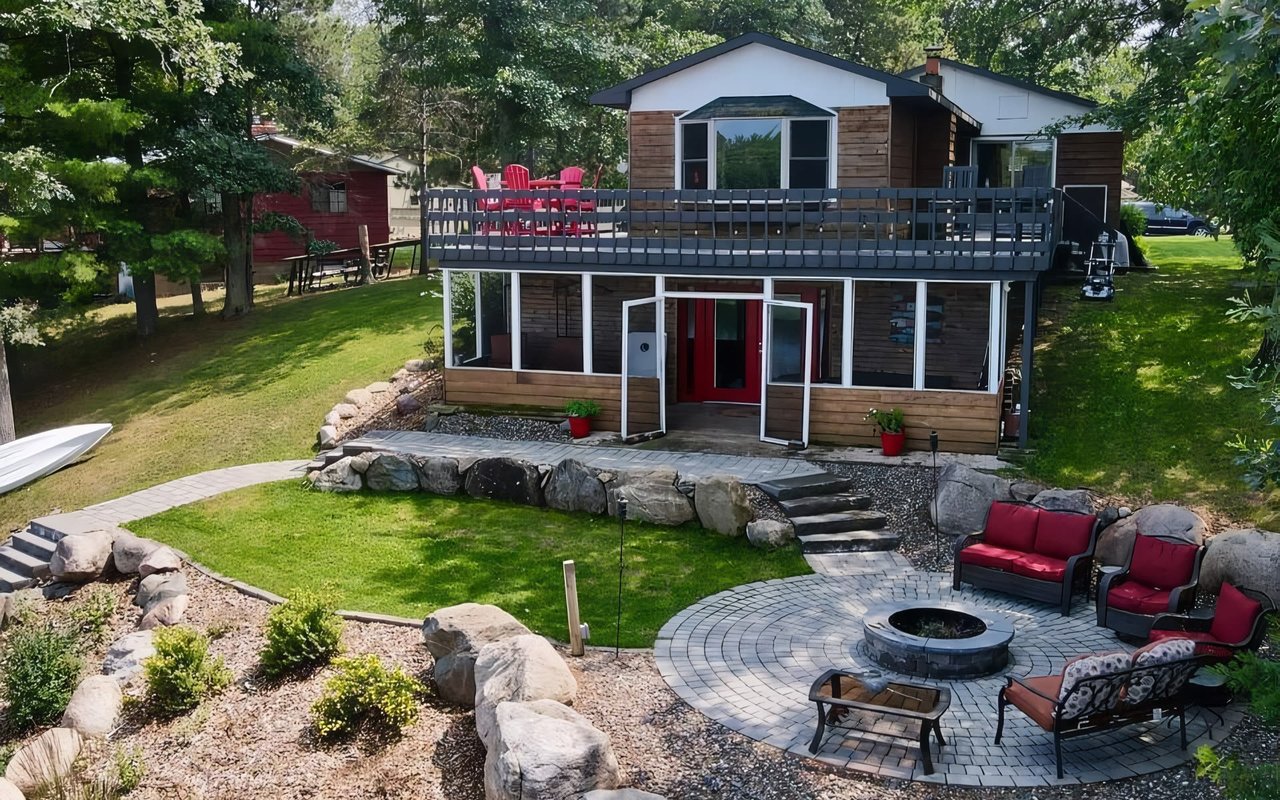
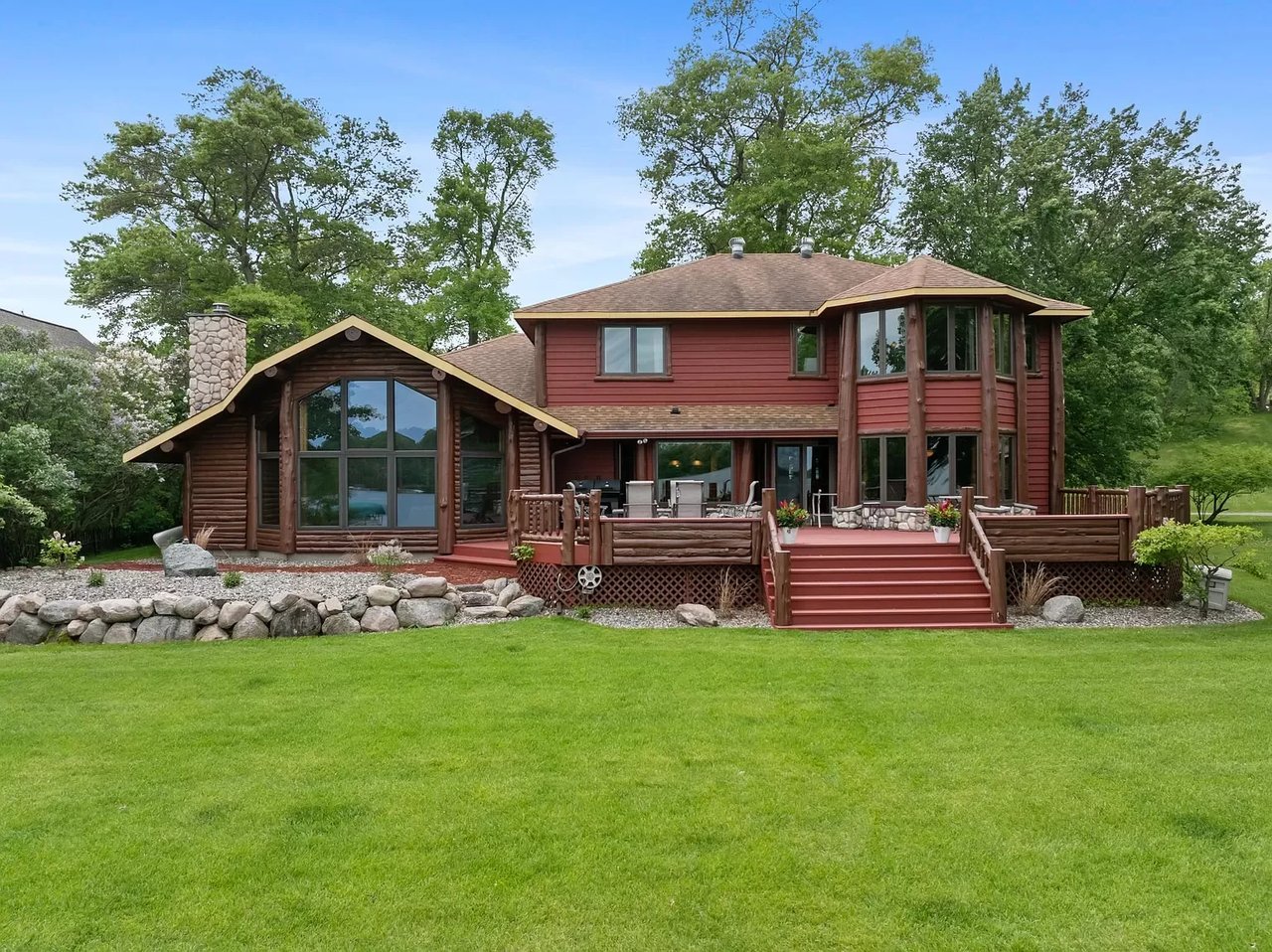
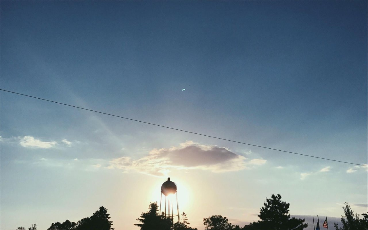
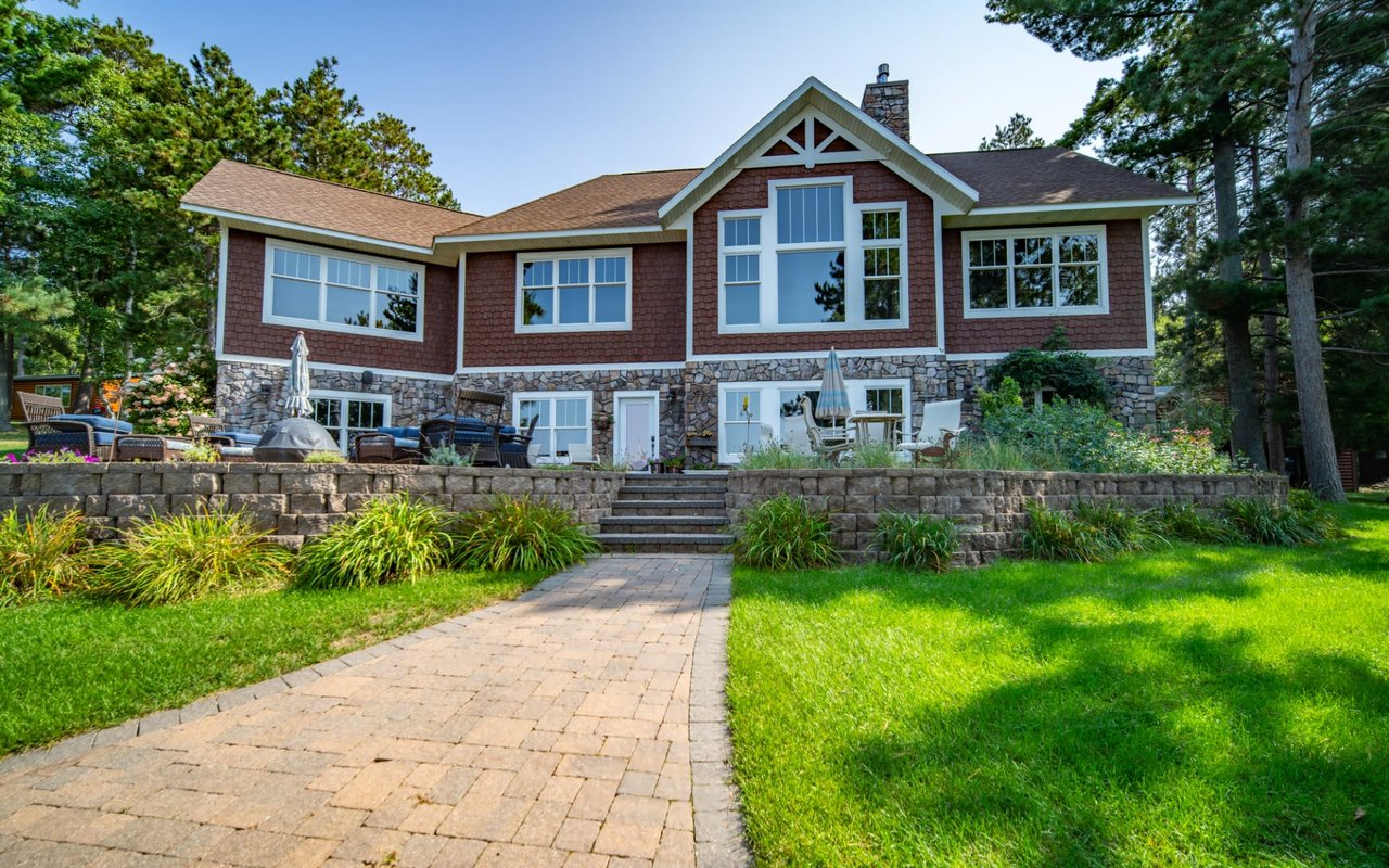
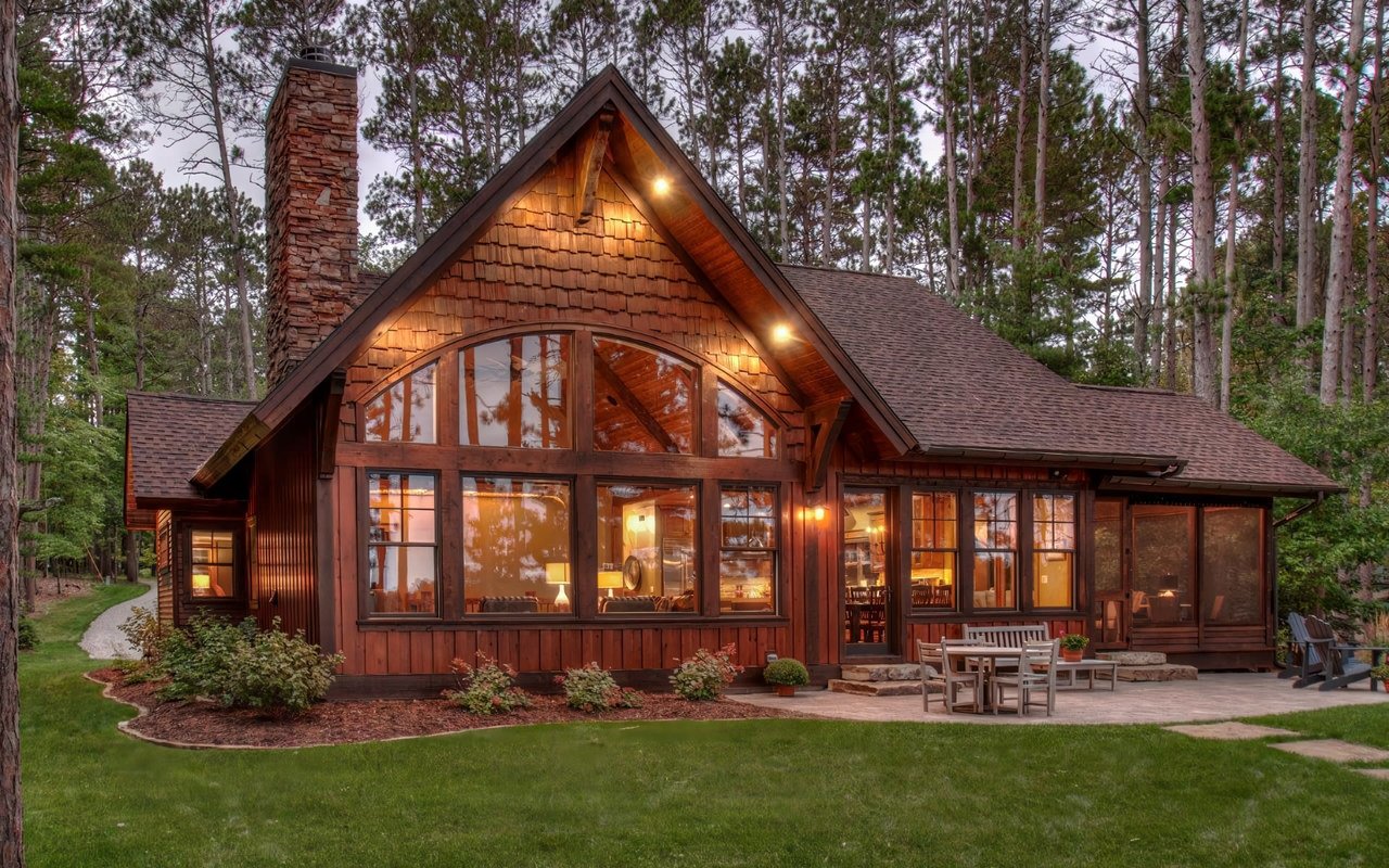
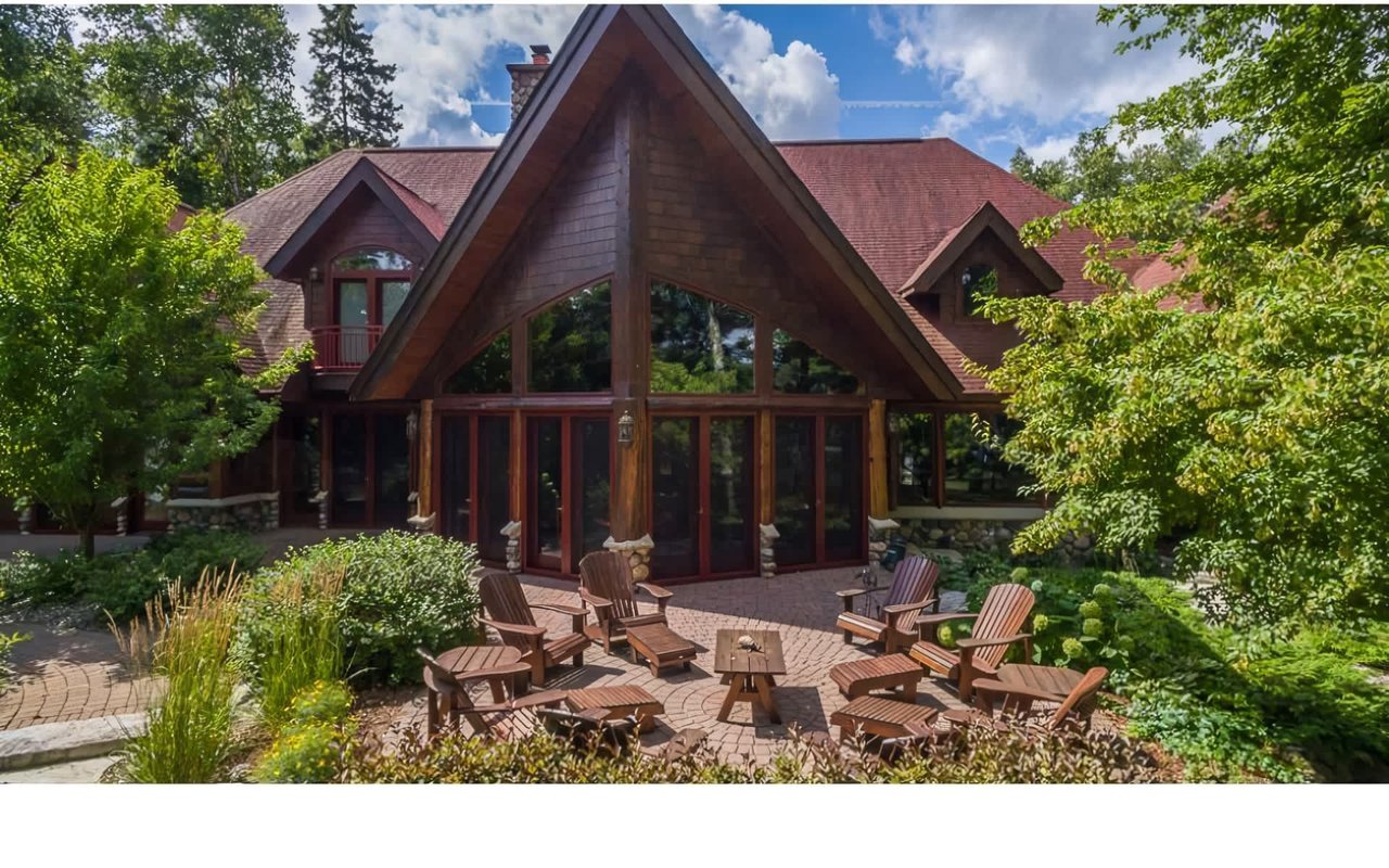
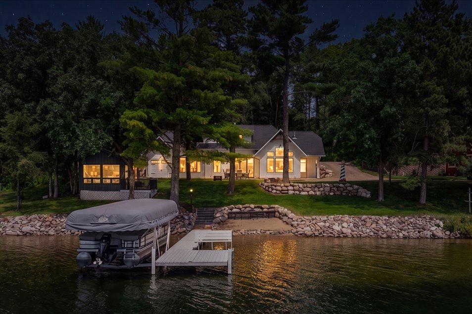
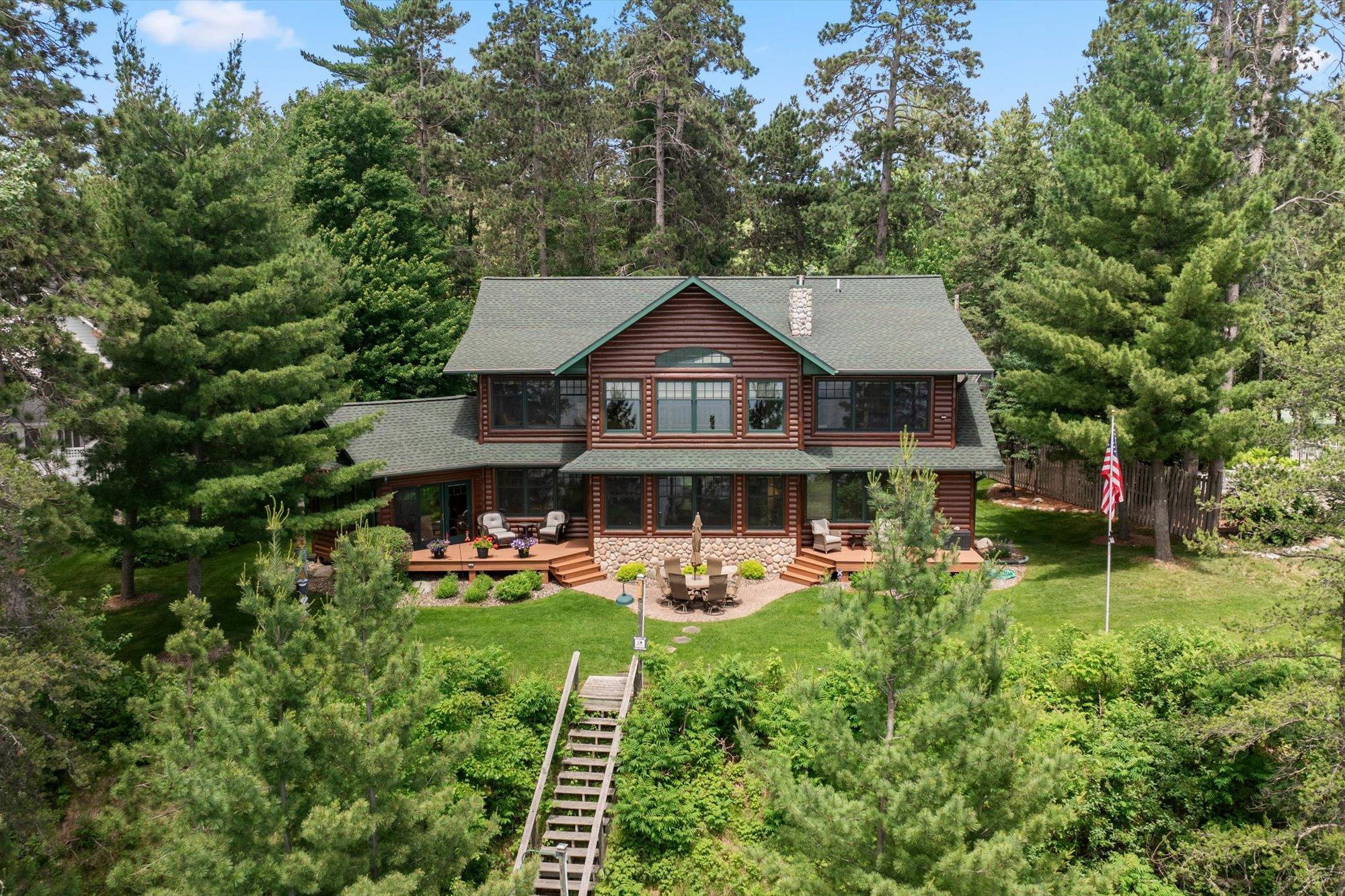
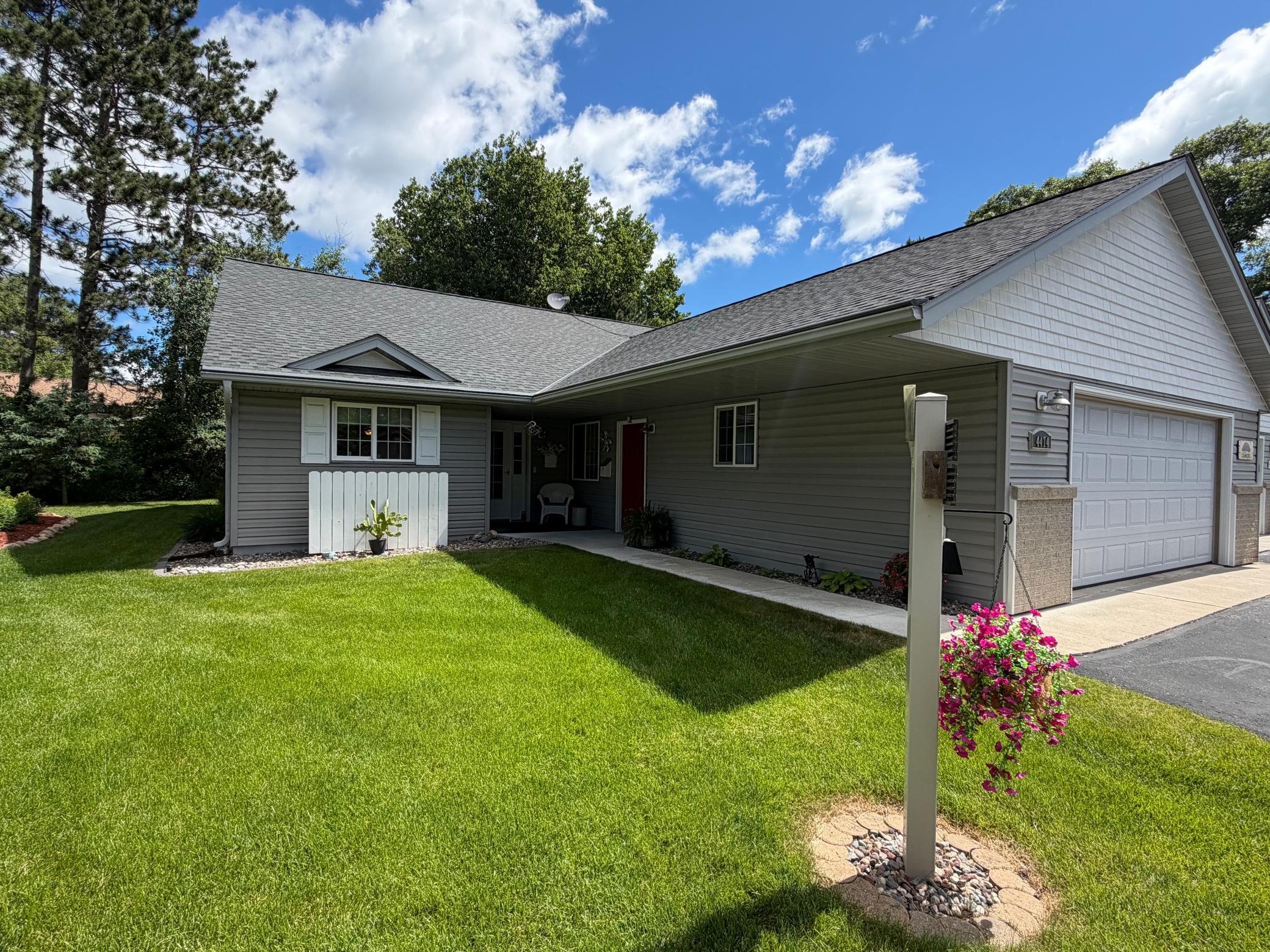
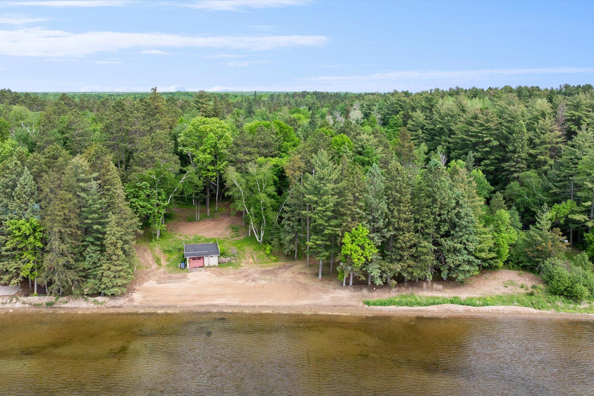
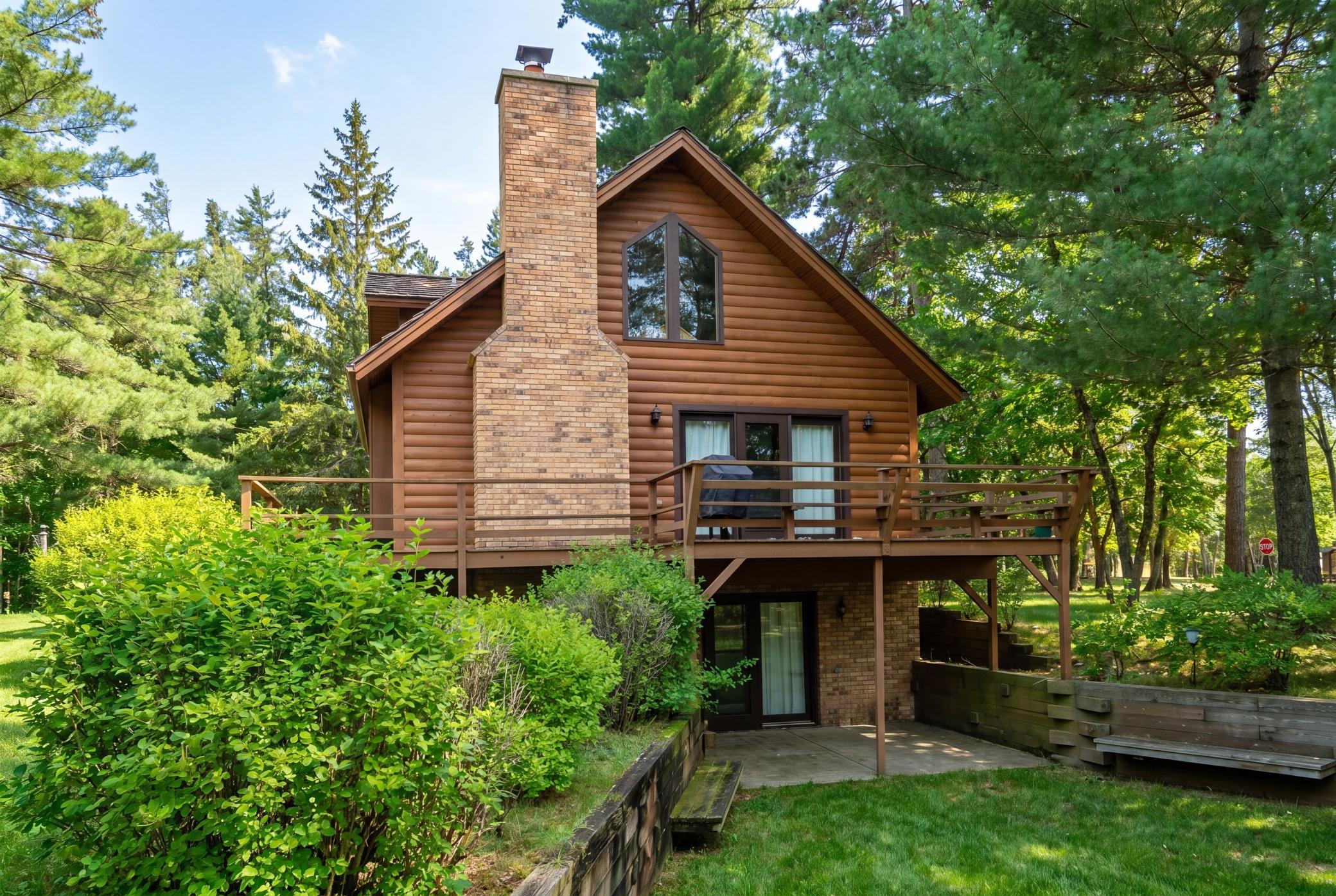
The entryway sets the tone for the entire home. Using color psychology here can influence how visitors feel as soon as they walk in. Soft earth tones or light blues can create a welcoming and serene atmosphere, while deeper hues like navy or forest green can evoke a sense of stability and sophistication. In Crosslake, many homeowners draw inspiration from the outdoors, bringing in shades that echo the pine forests and water views just beyond the front door.
If the entry is part of an open floor plan, choosing a color that complements adjoining rooms will create a sense of flow. Accent walls, painted furniture, or artwork can also introduce color in subtle but impactful ways without overwhelming the space.
If the entry is part of an open floor plan, choosing a color that complements adjoining rooms will create a sense of flow. Accent walls, painted furniture, or artwork can also introduce color in subtle but impactful ways without overwhelming the space.
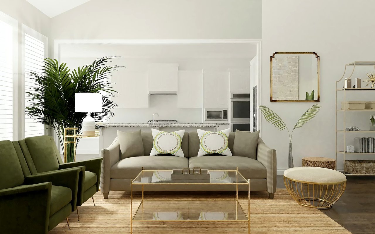
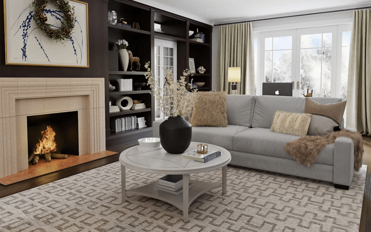
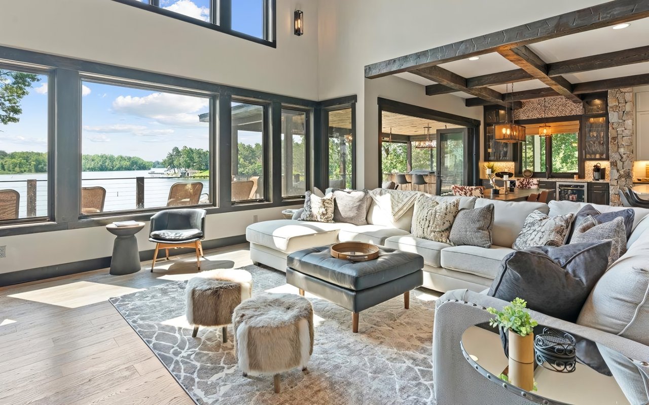
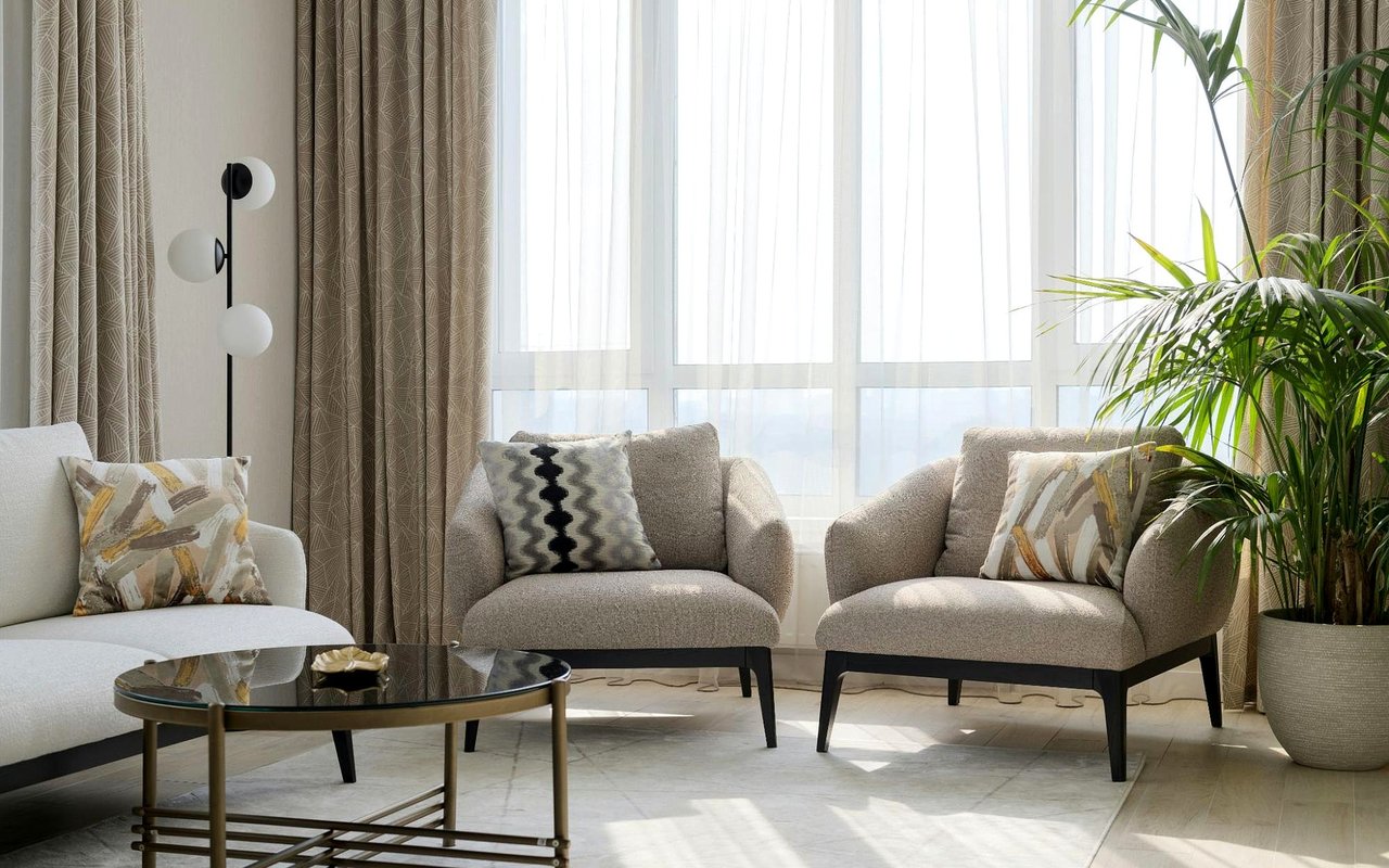
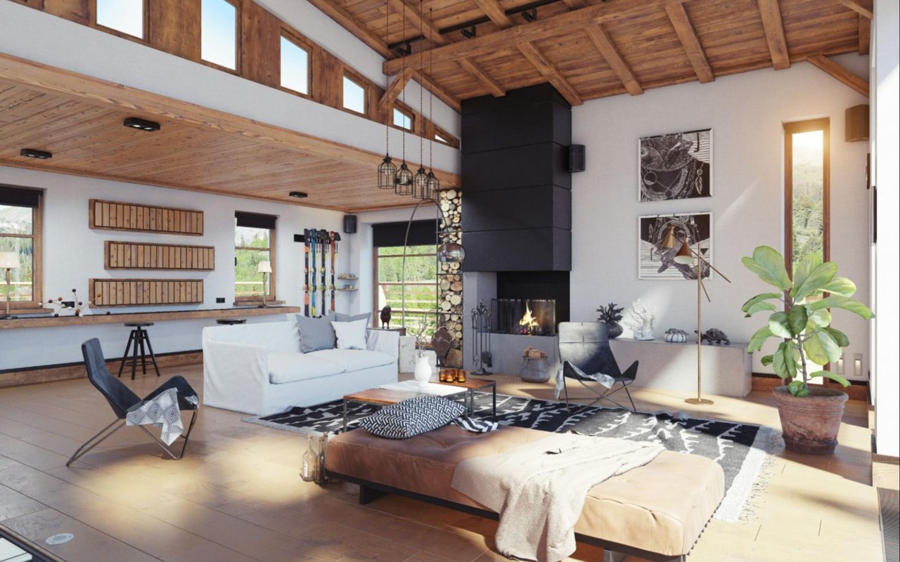
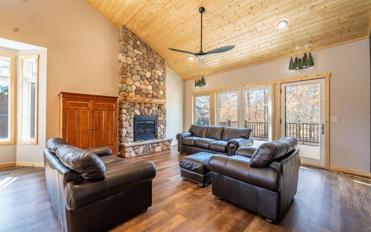
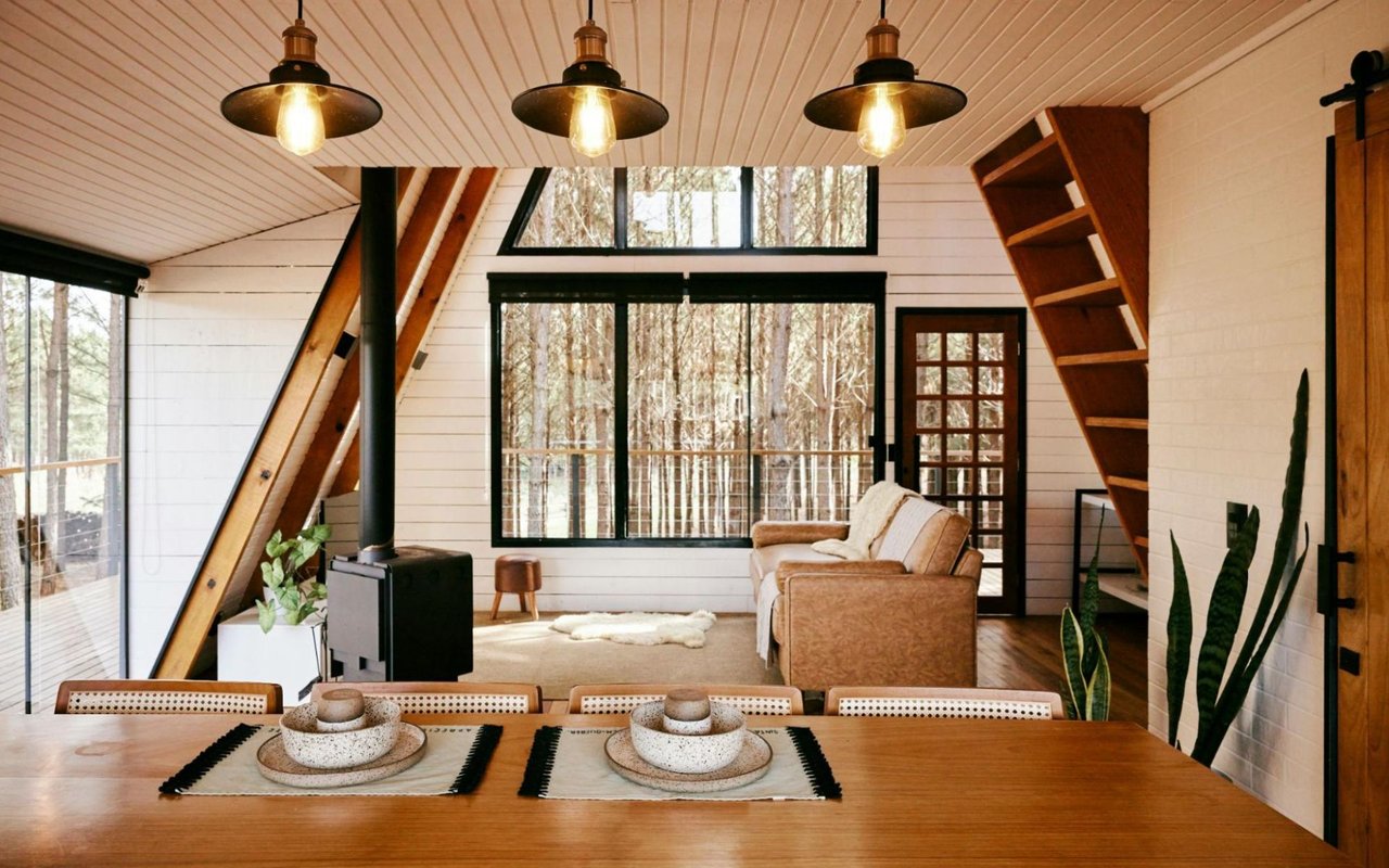
Designing Energizing Living Areas
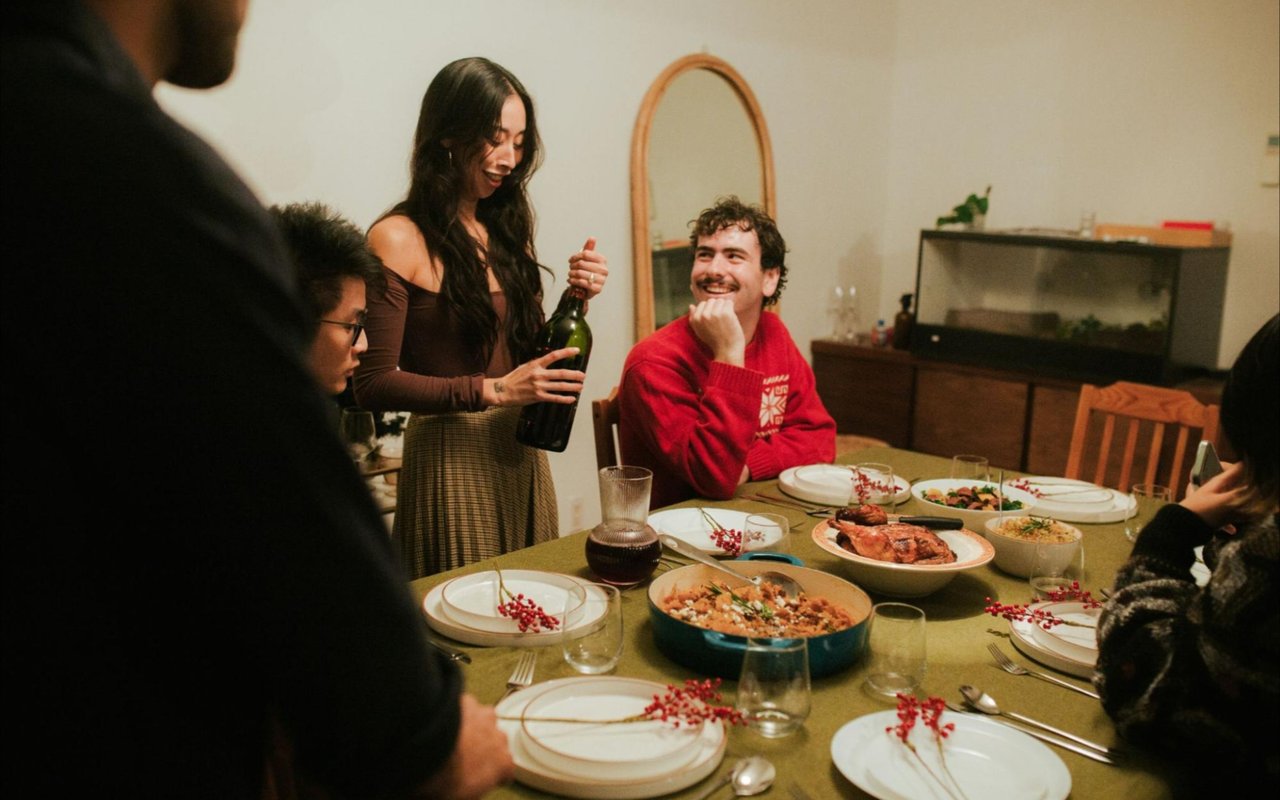
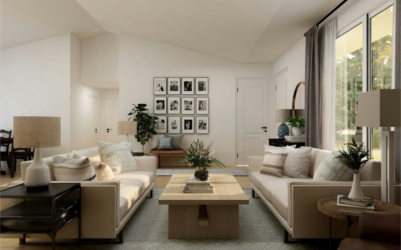
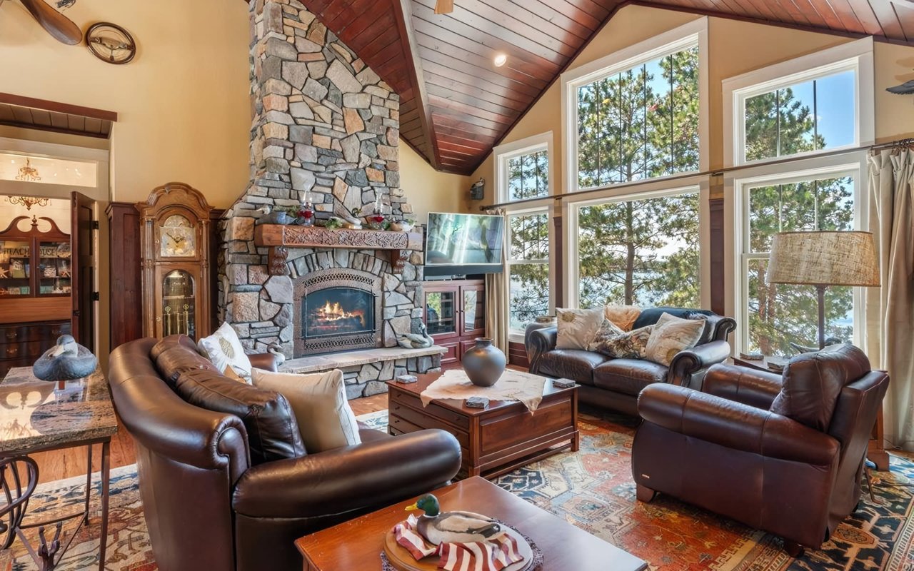
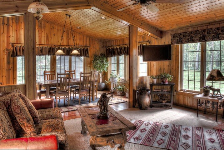
Living rooms and family rooms are typically the most social areas of a home, making them excellent places to explore color combinations that encourage connection and warmth. Incorporating color psychology in home design here might mean choosing rich, warm tones like terracotta, caramel, or gold to promote conversation and comfort. These shades can be balanced with cooler hues in furniture, textiles, or artwork to maintain visual interest.
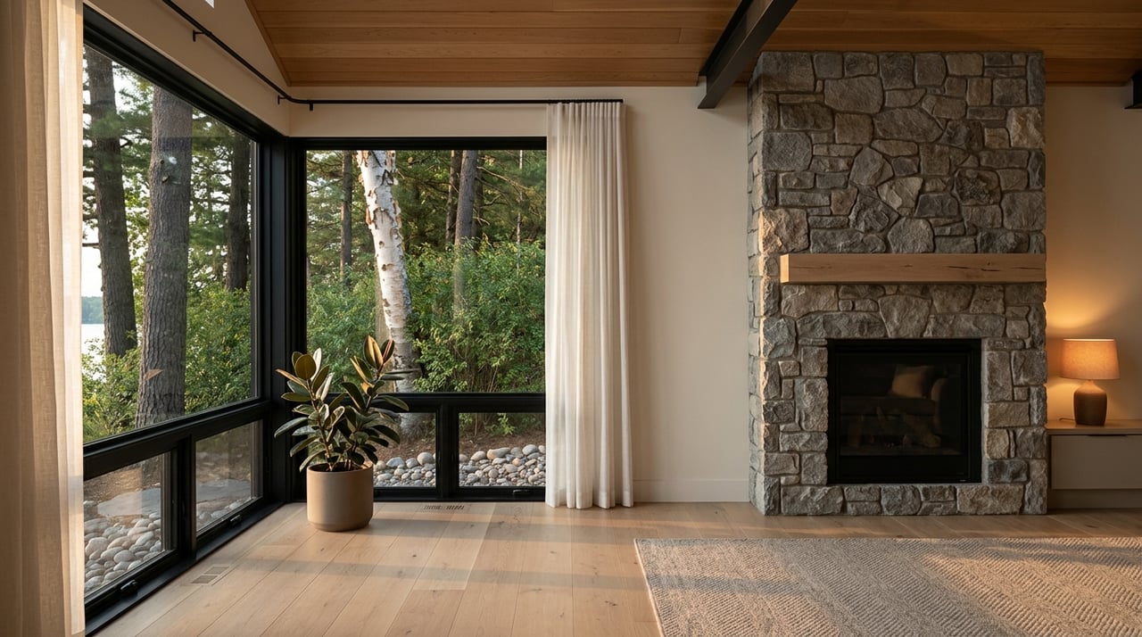
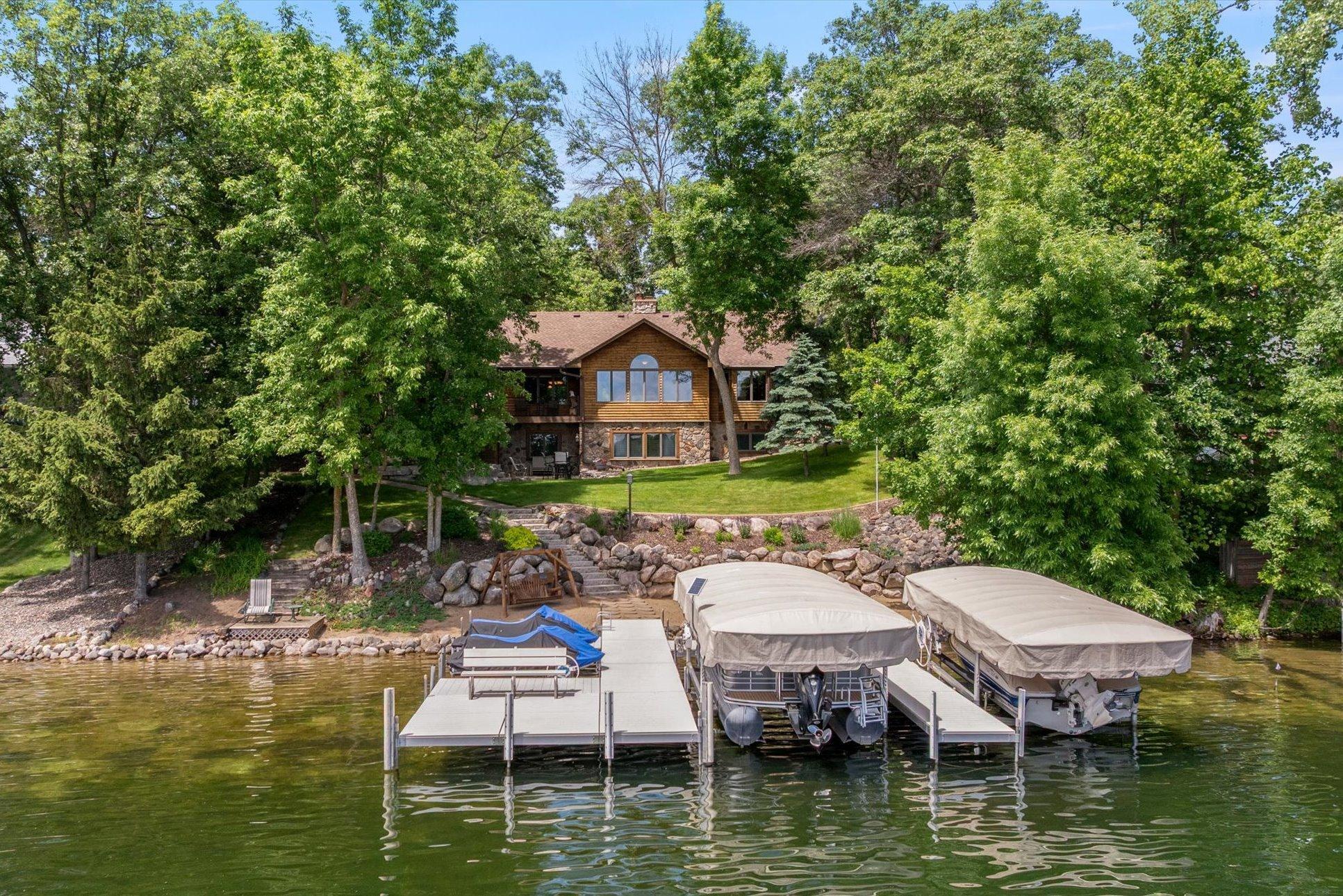
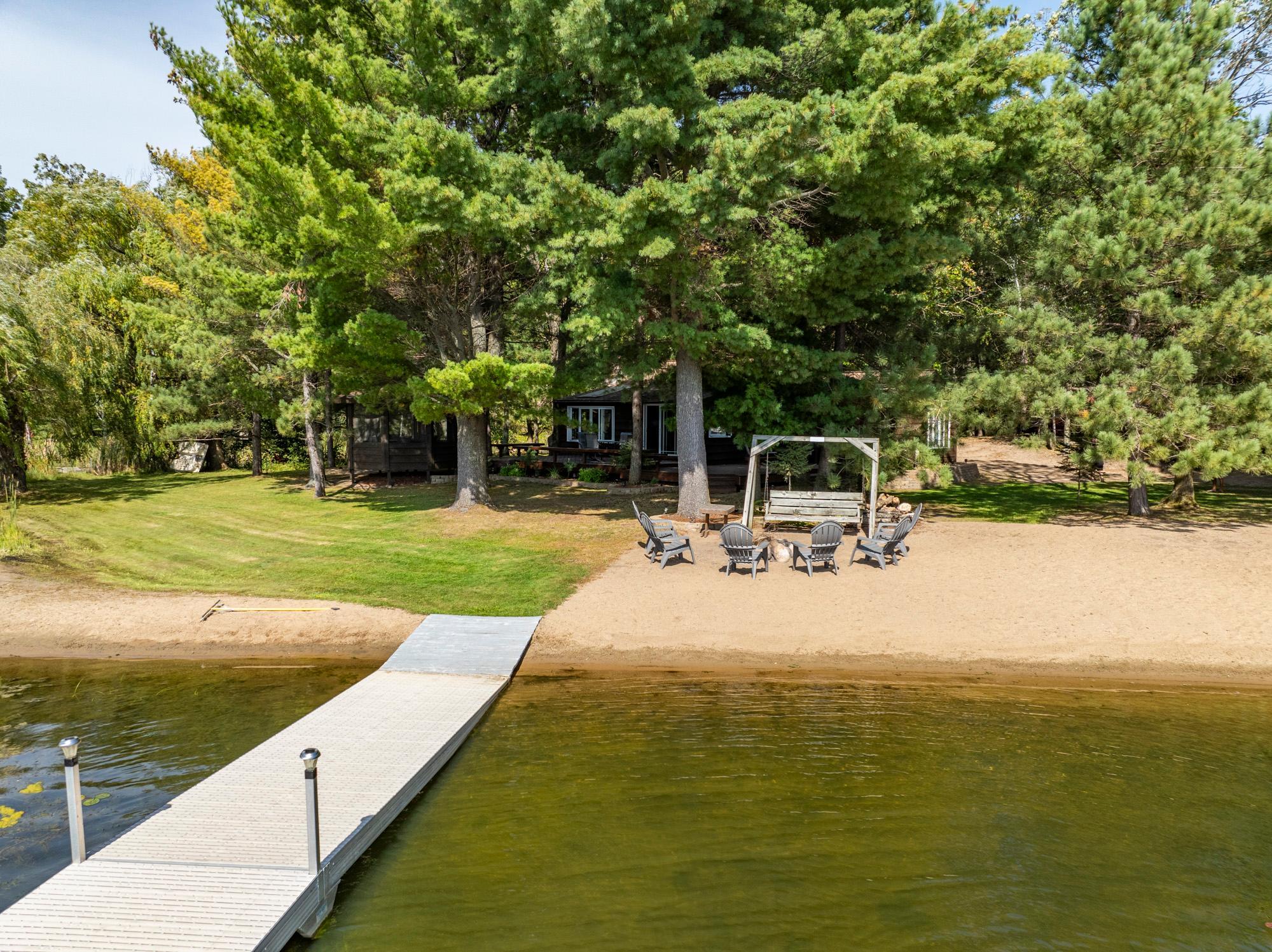
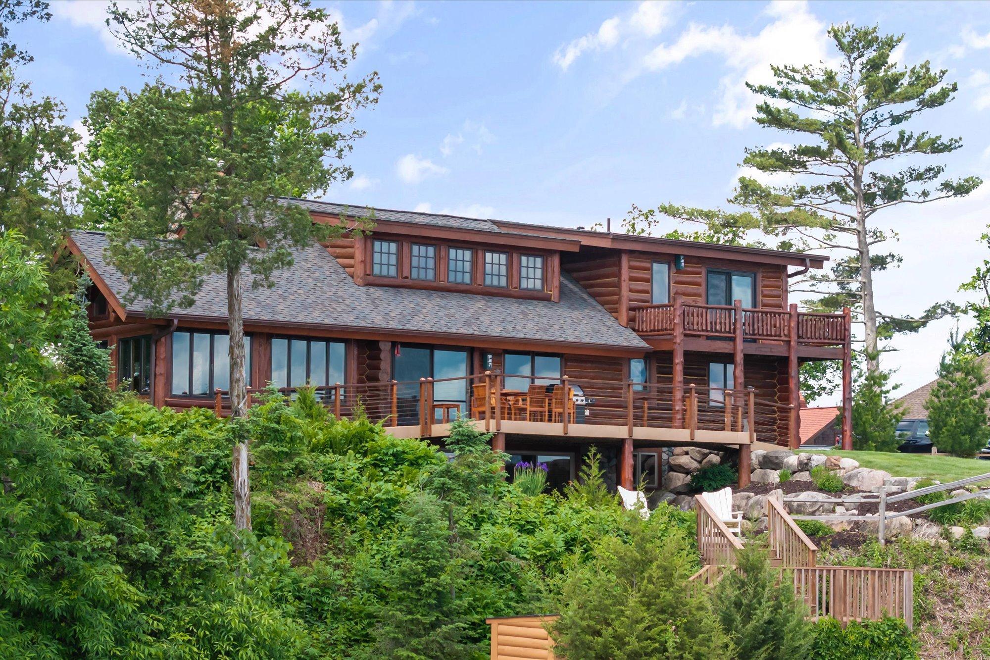
In Crosslake, where many homes feature fireplaces and large windows that frame outdoor views, incorporating natural colors can help tie the interior to the surrounding environment. A soft sage green or a muted sky blue, for example, can enhance both tranquility and cohesion.
In Crosslake, where many homes feature fireplaces and large windows that frame outdoor views, incorporating natural colors can help tie the interior to the surrounding environment. A soft sage green or a muted sky blue, for example, can enhance both tranquility and cohesion.
Promoting Focus and Productivity in Workspaces
With remote work becoming more common, home offices are an increasingly important part of residential design. Applying color psychology in home design to these spaces can support concentration and productivity. Blue, for example, is widely regarded as the best color for focus and mental clarity. Lighter blues can help reduce stress, while darker blues convey confidence and professionalism.
Alternatively, green offers a sense of balance and is easy on the eyes over extended periods, making it a great choice for those who spend long hours at their desks. Accent colors like orange or yellow can be used sparingly to inject creative energy without causing distraction.
Alternatively, green offers a sense of balance and is easy on the eyes over extended periods, making it a great choice for those who spend long hours at their desks. Accent colors like orange or yellow can be used sparingly to inject creative energy without causing distraction.
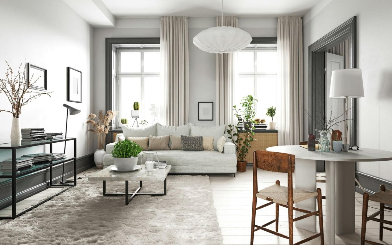
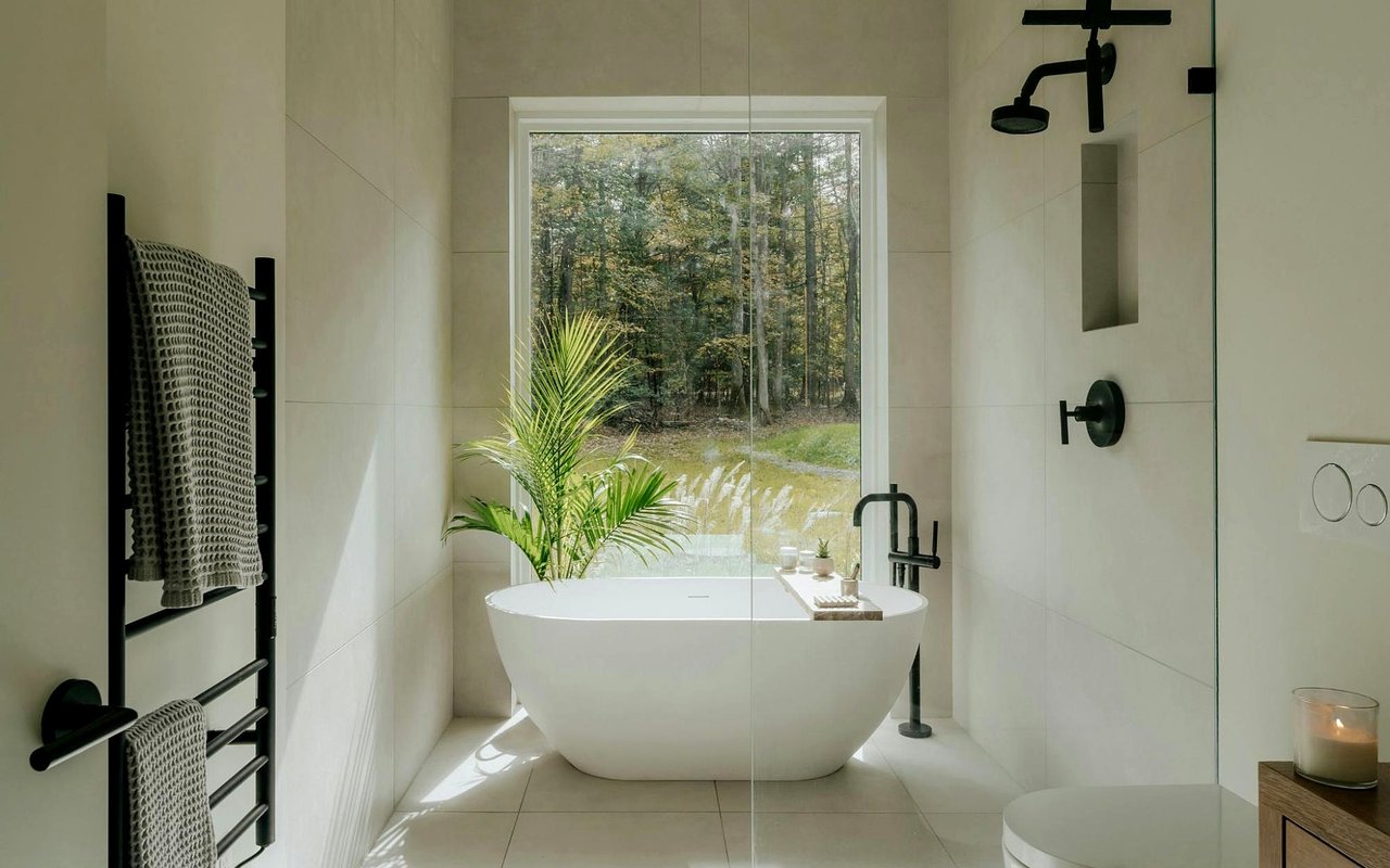
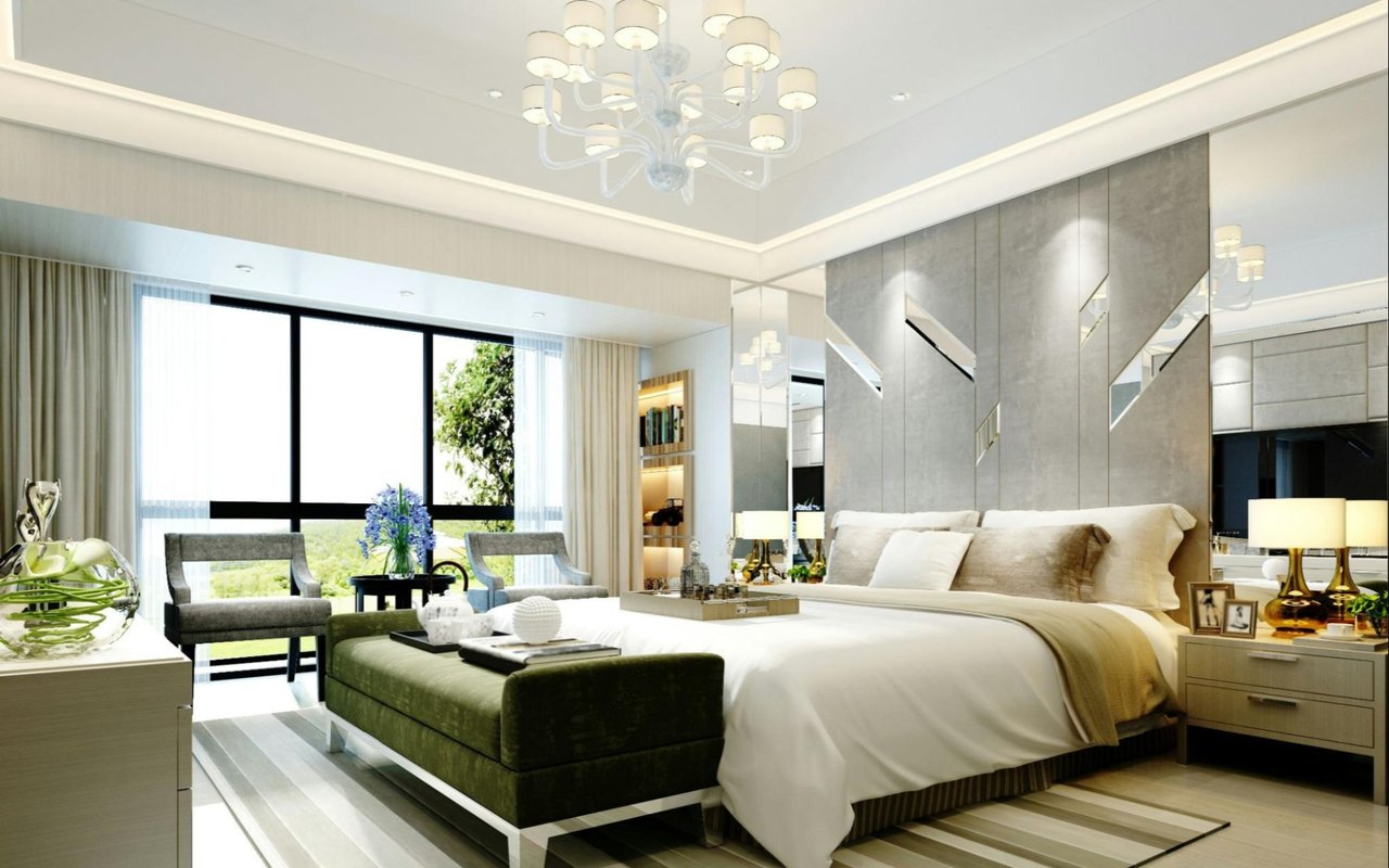
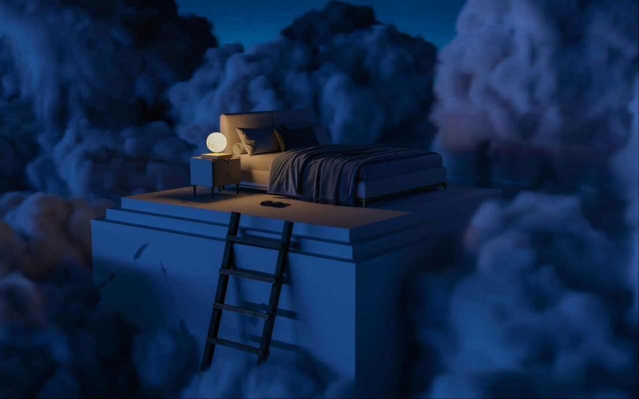
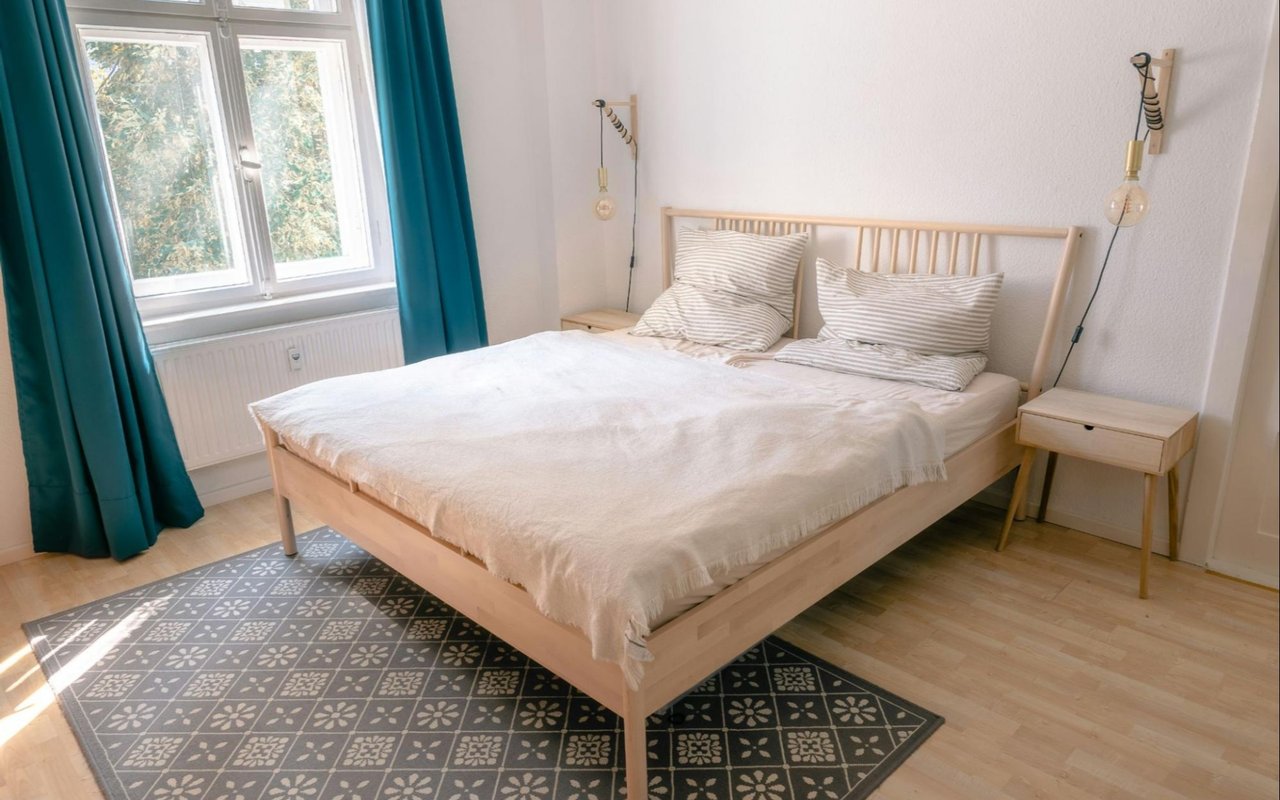
Enhancing Relaxation in Bedrooms
Bedrooms should serve as sanctuaries for rest and relaxation. Cool, muted tones like soft gray, pale lavender, dusty blue, or muted green are frequently used to promote calm and better sleep. These shades lower visual stimulation and create an atmosphere conducive to unwinding at the end of the day.
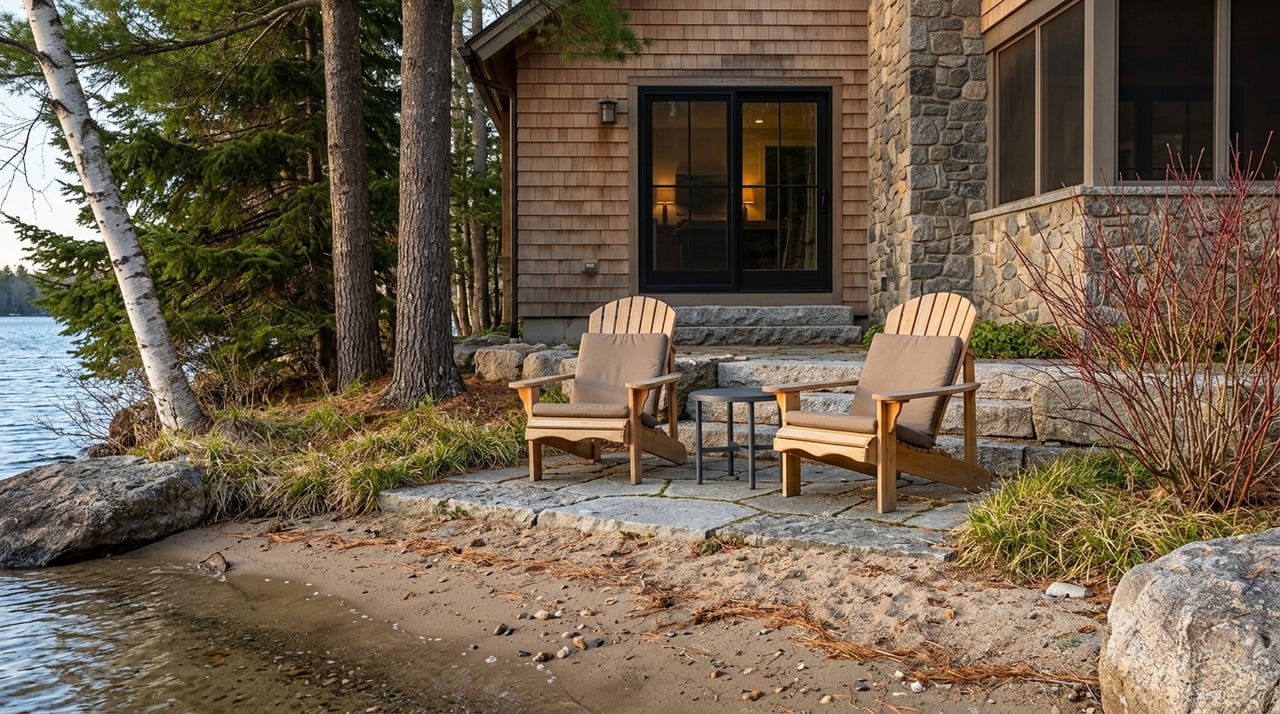
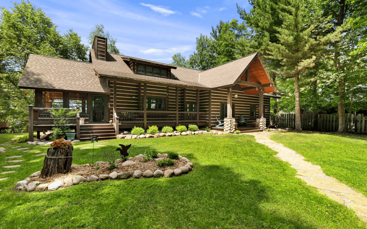
For master bedrooms in Crosslake properties that face the lake or woods, selecting colors that echo the natural landscape can further enhance the peacefulness of the space. Wood tones, linen textures, and layered neutrals also work well when using color psychology in home design to create serene personal retreats.
For master bedrooms in Crosslake properties that face the lake or woods, selecting colors that echo the natural landscape can further enhance the peacefulness of the space. Wood tones, linen textures, and layered neutrals also work well when using color psychology in home design to create serene personal retreats.
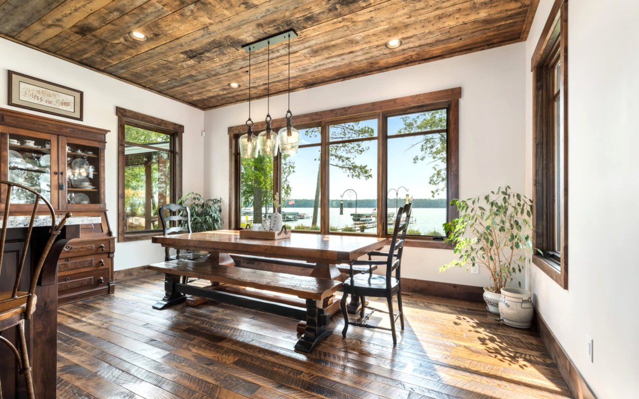
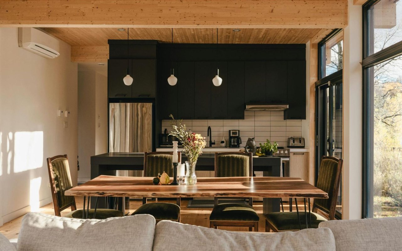
Elevating Kitchen and Dining Spaces
Color choices in kitchens and dining areas play a unique role in influencing appetite and mood. Warm tones such as deep reds or golden yellows can enhance hunger and create a cozy, inviting space for meals and gatherings. However, it's important to use these colors thoughtfully, especially in open-concept homes, so they don't overpower the surrounding areas.
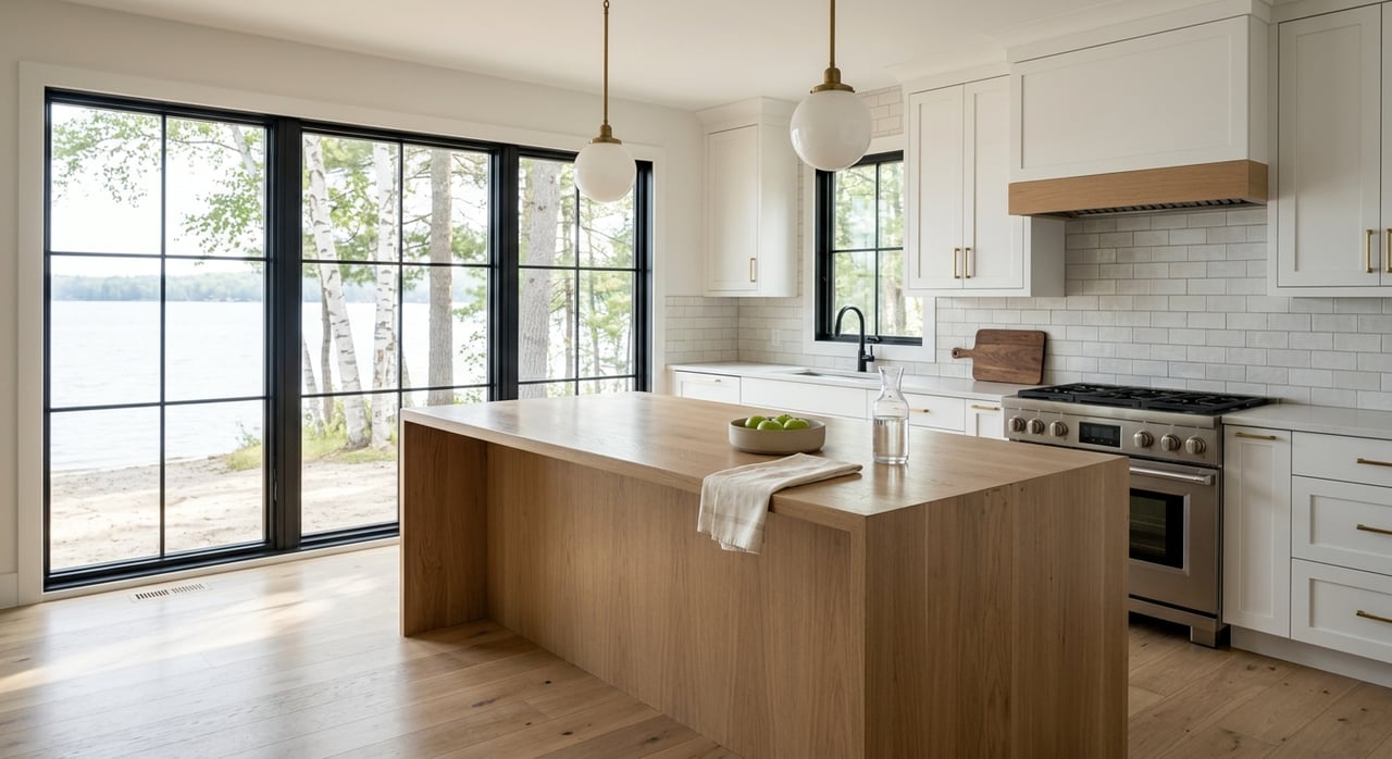
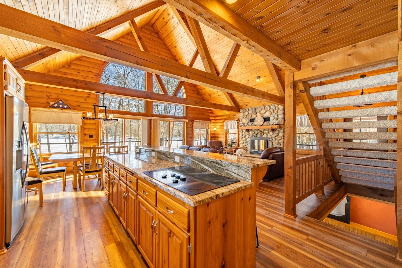
Soft whites, sage green, or dusty rose can modernize a kitchen while still promoting warmth. In Crosslake, many homes feature open kitchen layouts with wood cabinetry, granite countertops, and stainless steel appliances. A well-chosen color on the walls or backsplash can add personality while maintaining cohesion with natural materials.
Soft whites, sage green, or dusty rose can modernize a kitchen while still promoting warmth. In Crosslake, many homes feature open kitchen layouts with wood cabinetry, granite countertops, and stainless steel appliances. A well-chosen color on the walls or backsplash can add personality while maintaining cohesion with natural materials.
Using Accent Colors for Personality
Even if a homeowner prefers neutral walls, color psychology in home design can still be expressed through furniture, art, rugs, pillows, and other accents. These elements offer a low-commitment way to experiment with different emotional tones throughout the home. For example, a bold teal armchair can energize a quiet room, while a lavender throw can soften the feel of a minimalist space.
Accent colors also allow homeowners to reflect seasonal shifts in Crosslake. Bright corals and seafoam greens feel appropriate in summer, while rusts and deep burgundies can warm up interiors during winter. The flexibility of accents ensures the home evolves along with the homeowner’s needs and moods.
Accent colors also allow homeowners to reflect seasonal shifts in Crosslake. Bright corals and seafoam greens feel appropriate in summer, while rusts and deep burgundies can warm up interiors during winter. The flexibility of accents ensures the home evolves along with the homeowner’s needs and moods.
Adding Value Through Strategic Color Choices
Beyond style and mood, color psychology in home design can impact resale value. Homes with cohesive, neutral palettes tend to appeal to a broader audience, while accent colors can highlight architectural features or define spaces in open layouts. Well-chosen paint colors can also make small rooms feel larger, dark rooms feel brighter, or outdated spaces feel refreshed.
In the Crosslake real estate market, where buyers often seek lifestyle properties that offer relaxation and retreat, color plays a vital role in creating that emotional connection during showings. A home that feels calm, balanced, and well-designed can leave a lasting impression and command a stronger offer.
In the Crosslake real estate market, where buyers often seek lifestyle properties that offer relaxation and retreat, color plays a vital role in creating that emotional connection during showings. A home that feels calm, balanced, and well-designed can leave a lasting impression and command a stronger offer.
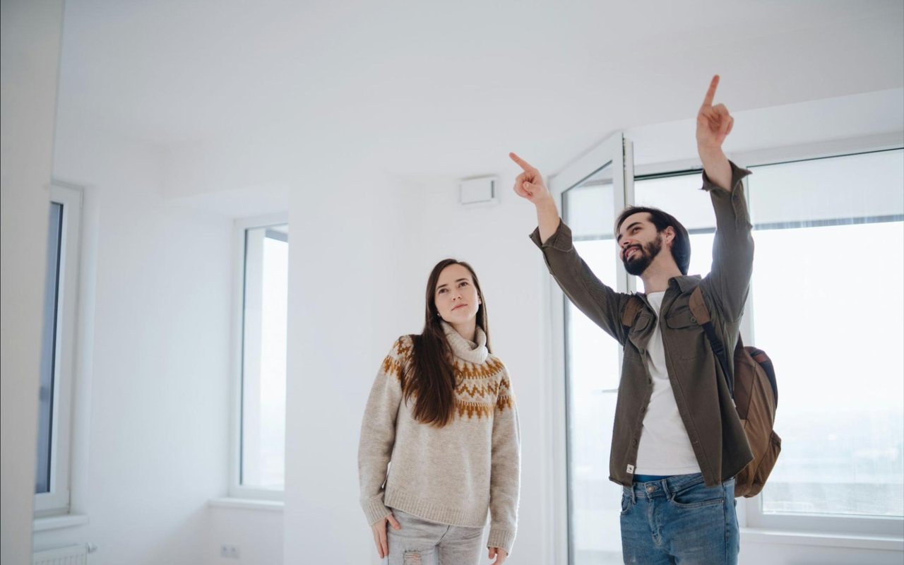
Contact Larson Group to Explore Color-Driven Home Transformations
Whether you're preparing to list your home, designing a new build, or simply refreshing a space, incorporating color psychology in home design can enhance how a property looks and feels. For homeowners in Crosslake who want to create meaningful, value-adding spaces, Larson Group provides expert guidance, local insight, and personalized service. Reach out today to explore how thoughtful design choices—starting with color—can transform your home into a sanctuary that supports your lifestyle and stands out in the market.